
YOUR (WELL-STUFFED) SPRING / SUMMER CUSHION EDIT
Cushions – they just make everything better, don’t they?
My husband, who doesn’t entirely agree with the initial statement and actually finds the sheer number we own somewhat ludicrous, would testify to my mild obsession. In truth, cushions are a fundamental part of my work – and life! Comfy, stylish and an easy (and relatively inexpensive) way to introduce new design trends into any scheme. Perfect if you only wish to dabble in ‘adventurous’ rather that enlist.
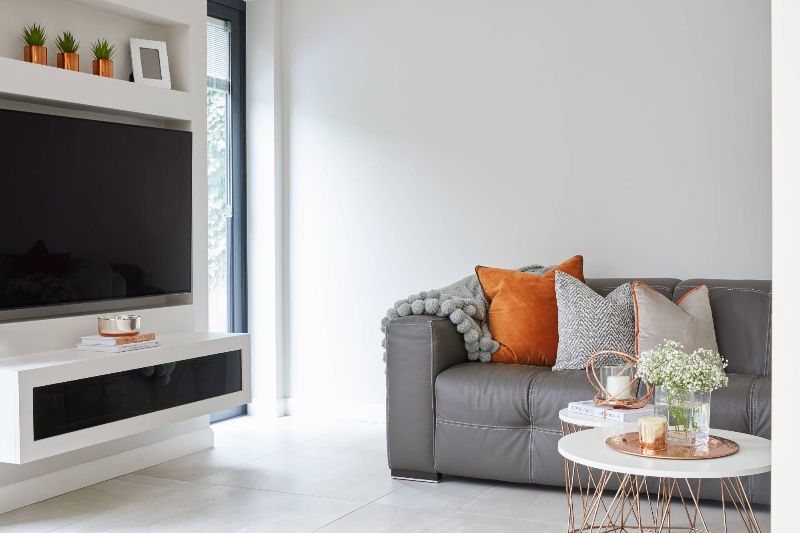 I added a colour-pop through the cushions and accessories on this project. Incorporating interchangeable accents is a great way dabble in a trend or two. Image source: Sarah Mailer Design
I have an interesting relationship with trends. In a way, I’m a huge fan. I love the newness – the sense of fun and frivolity of moving forward. Trends can encourage us to perhaps step out of comfort zones and push boundaries. But they can be polarizing – and somewhat fleeting. This is why trends aren’t necessary for large, long-term investment pieces such as sofas and sideboards. For these pieces, my advice is always to opt for classic designs that have timeless appeal.
Accessories are more of a short-term commitment and by far the best way to connect to the latest fad.
 The spectacular wall of cushions at Andrew Martin International – a cushion lover’s paradise!
I approach interior accessorizing much like fashion – slightly more ‘throw away’ and risky (although I often tend to revert back to the classics, especially for investment pieces)! Cushions are a great way to have some fun with a scheme through adventurous pattern, texture and colour which can change with the season or as mood dictates.
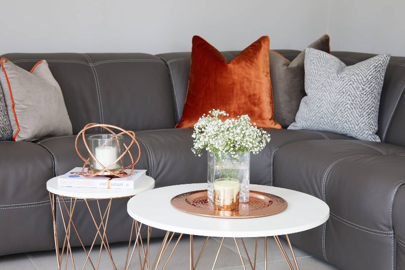 It’s all about layering different colours and textures. I also love the contrast piping on these cushions, which I styled at Sarah Mailer Design
SPRING/SUMMER 2018 CUSHION EDIT
I’ll admit it – I love a product edit. Trawling through the endless options available to curate a clean and refined selection of gorgeousness is certainly how I like to spend an evening – or week.
This cushion edit is designed to help you incorporate the latest trends into your home. It’s easy and breezy – you’ll be amazed at how a few throw cushions can transform the look and feel of any space. As a catalyst for each theme, I’ve taken inspiration from the catwalk (because, who doesn’t love an interiors and fashion mash-up)?!
All pieces are available now and you can shop them directly by clicking on the product information. I’d love to see how you style them up…
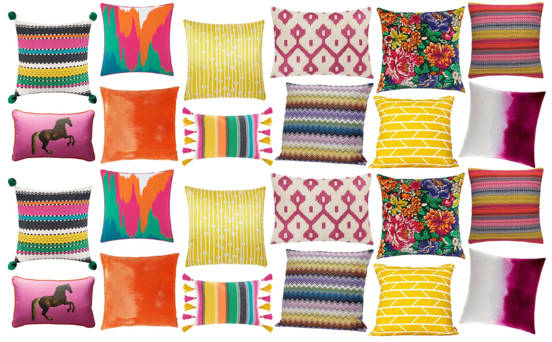
#1. SATURATED BRIGHTS: CUSHION EDIT
 Top left to right: A by Amara – Regale Pom Pom Cushion | A by Amara – Trapeze Cushion | West Elm – Quarzia Alga Cushion Cover in Citrus Yellow | John Lewis Fusion Ikat Cushion – Jaipur Dusk | Liberty London – 34 Garden of Beauty Velvet Cushion | Habitat – Agnes Bright Stripe Cushion | Bottom left to right: Andrew Martin – Whistlejacket Cushion in pink | Habitat – Regency Orange Velvet Cushion | A by Amara – Gallery Tassel Cushion | Missoni Home – Rajam chevron cushion | John Lewis – Laura Spring Convergence Cushion | Bluebellgray – Cerise Paintbox Cushion
Even if the weather is more blizzard than Miami beach outside, these beauties will bring the sunshine! Brights have made a real comeback and are a great way to add a vibrant touch to a neutral backdrop.
I always suggest mixing trusted plains with large and small prints, colour-blocked stripes and photographic motifs. You could even introduce some contrasting pom-pom, piped or Oxford edging, alongside bright, summer florals which are ever-cool. In terms of dressing a sofa, I like repetition, although you can mix and match for a casually eclectic, bohemian vibe. For key colours to watch, read my post on colour trends.
‘Saturated Brights’ moodboard inspired by Versace SS’18 (catwalk shot: Getty Images).
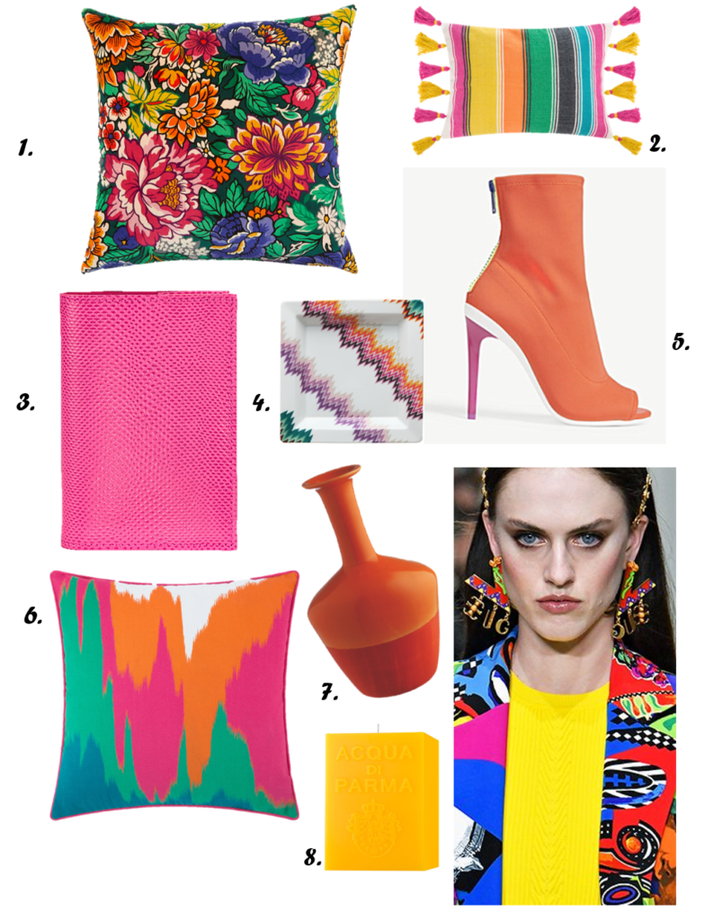 1. Liberty London – 34 Garden of Beauty Velvet Cushion | 2. A by Amara – Gallery Tassel Cushion – 35x50cm | 3. Aspinal of London – Lizard-effect A7 refillable leather journal | 4. Missoni Home – Zig Zag Square Tidy Tray | 5. Aldo – Ulyssia peep toe shoe | 6. A by Amara – Trapeze Cushion – 45x45cm | 7. Habitat – Demi Orange Glaze Ceramic Bottle Vase | 8. Acqua Di – Colonia cube candle 1kg
#2. MONOCHROME CHIC: CUSHION EDIT
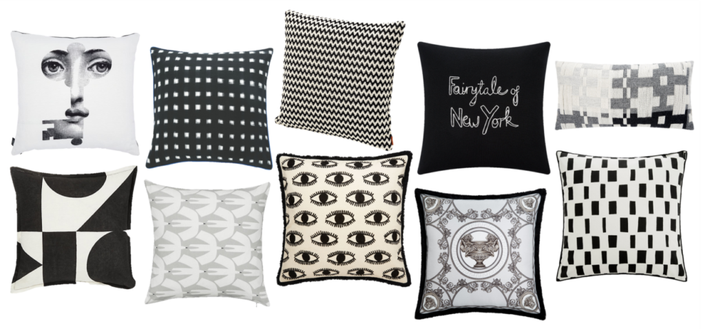 Top left to right: Fornasetti – Chiave Pillow | Habitat – Black And White Ikat Woven Cushion | Missoni Home – Varsavia Cushion | Bella Freud – Fairytale Of New York Cushion | Donna Wilson – Pennan Woven Cushion in Black/White | Bottom left to right: Patternity x John Lewis – Ritual-Repeat Cushion | Scion Pajaro Cushion, Grey | Eyes Black And White Embroidered Cushion With Fringing | Versace – La Mini Coupe Silk Cushion | Marimekko – Iso Noppa Cushion Cover
This is one of my favourite looks – who would have guessed?!
This monochromatic cushion edit champions quirky graphic prints alongside timeless Missoni chevrons and an opulent touch of silk Versace. You can also throw in some fun, Crayola brights (#1) which feel incredibly fresh alongside this desaturated palette or keep it cool, clean and decidedly ’90s. Gold accents also work a total treat.
‘Monochrome Chic’ moodboard inspired by Self-Portrait SS’18 (catwalk shot: Getty Images).
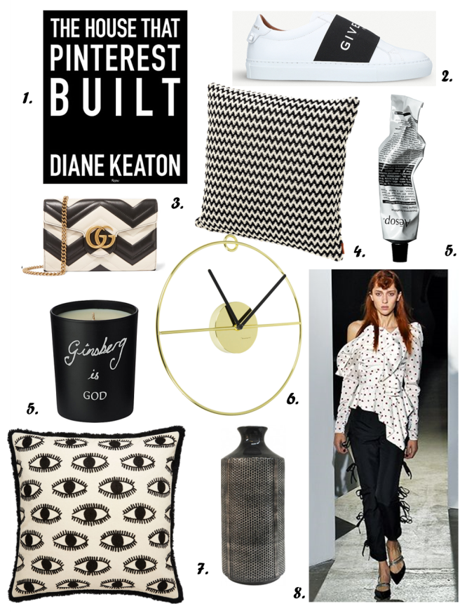 1. Diane Keaton – The House That Pinterest Build (Hardcover) | 2. Givenchy – Knot elastic leather trainers | 3. Gucci – GG Marmont quilted leather shoulder bag | 4. Missoni Home – Varsavia Cushion 40x40cm | 5. Aesop – Reverence Aromatique hand balm 75ml | 6. Bloomingville – Art Deco Wall Clock – Gold/Black | 7. Habitat – Eyes Black/White Embroidered Cushion with Fringing 50x50cm | 8. Kelly Hoppen London – Mesh Bottle Vase
#3. TEXTURAL TREATS: CUSHION EDIT
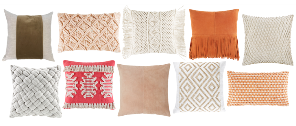 Top left to right: Kelly Hoppen Home – Mayfair Velvet Cushion | Maisons Du Monde – Pink Cotton Macramé Cushion | Maisons Du Monde – Ivory Macramé Cotton Cushion | Maisons Du Monde – Orange Fringed Leather Pouffe | A by Amara – Gibberd Crochet Cushion | Bottom left to right: Maisons Du Monde – Grey Woven Cushion | Kas – Oneil Cushion in Coral | Habitat – Nude Suede Cushion | Jute and Cotton Cushion with Graphic Motifs | Maisons Du Monde – Cotton Cushion with Graphic Motifs
Every good scheme needs some textural layering to add interest and volume. Combine chunky knits, artisan weaves, raw edging and homespun embroidery with luxury velvets and buttery suedes for an interesting juxtaposition.
If you’re not a huge fan of colour, mixing texture in neutral shades is a great way to add depth to your space. I love pieces that combine textures and incorporate an element of overlay. And fringing is going to be huge (again)…!
‘Textural Treats’ moodboard inspired by Roksander SS’18 (catwalk shot: Getty Images).
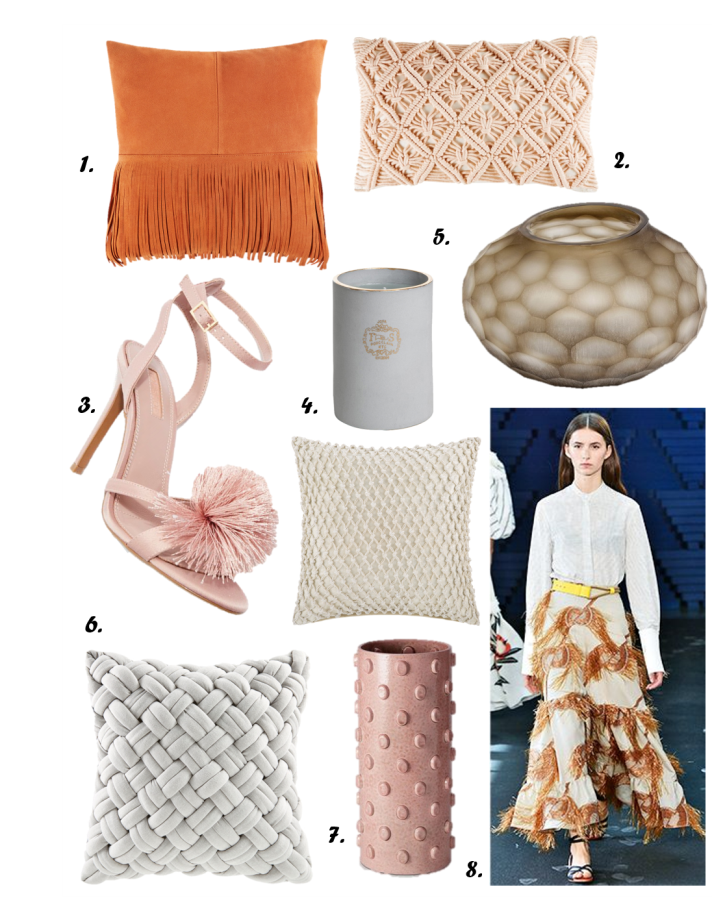 1. Maisons du Monde – Orange Fringed Leather Pouffe 40x40cm | 2. Maisons Du Monde – Pink Cotton Macramé Cushion| 3. Topshop – Renee Pom Pom Sandals | 4. Joya –
Âmes Sœurs candle 260g | 5. Guaxs Bangui – small vase | 6. A by Amara – Gibberd Crochet Cushion 45x45cm in Cream | 7. Maisons Du Monde – Grey Woven Cushion | 8. L’objet – Teo Vase in pink|
#4. PASTEL POWER: CUSHION EDIT
 Top left to right: Etro – Cergy Cushion in lilac | Habitat – Aliona Green Interwoven Cushion | A by Amara – Escot Applique Cushion | A by Amara – Killerton Cushion in pink | Sanderson Home – Wisteria Blossom cushion | Bottom left to right: Andrew Martin – Kingdom Power Cushion | Petite Friture – Volutes Rectangular Cushion in pink/red | West Elm – Woven Silk Cushion Cover in Pink Sorbet | Eichholtz – Licorice Blue Pillow | Tom Dixon – Deco Cushion in pink
This is slightly controversial but I have never been the biggest fan of pastels… They just never felt like ‘me’. That being said, I’m noticing my pastel preferences shifting and I even bought a lilac – yes, LILAC – top the other day. This is a look that cannot be escaped and is only gathering momentum.
Up your cushion game and channel the catwalks of Dries Van Noten, Emilia Wickstead and Céline, mixing soft sorbet shades to stay totally on-trend. Beige and greige backdrops work a treat with these pretties. Consider adding black accents into the mix to ground the look and add some edge.
‘Pastel Power’ moodboard inspired by Celine SS’18 (catwalk shot: Getty Images).
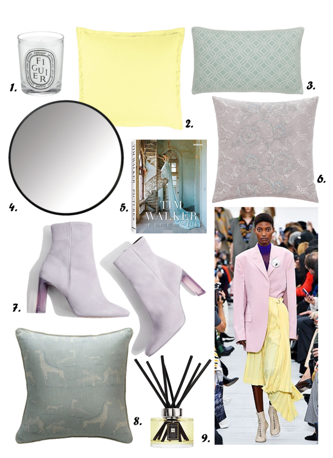 1. Diptyque – Figuier Scented Candle | 2. Designers Guild – Biella Pale Yellow Square Breakfast Cushion | 3. Sanderson Home – Wisteria Blossom cushion| 4. Umbra – Hub Mirror | 5. Tim Walker – Pictures coffee table book | 6. Etro – Cergy Cushion in lilac | Habitat – Aliona Green Interwoven Cushion | 7. Topshop – Hibiscus Ankle Boots | 8. Andrew Martin – Kingdom Power Cushion | 9. Jo Malone London – English Pear & Freesia diffuser 165ml
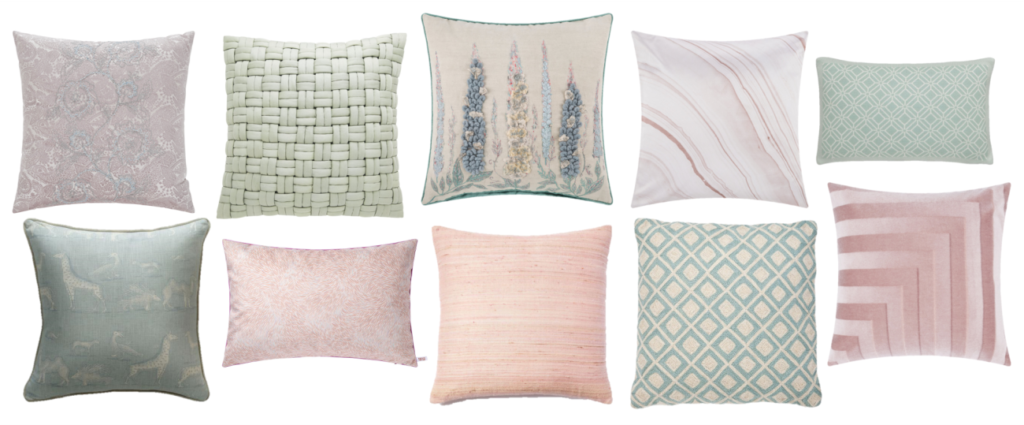
#5. NEW NEUTRALS & METALLICS: CUSHION EDIT
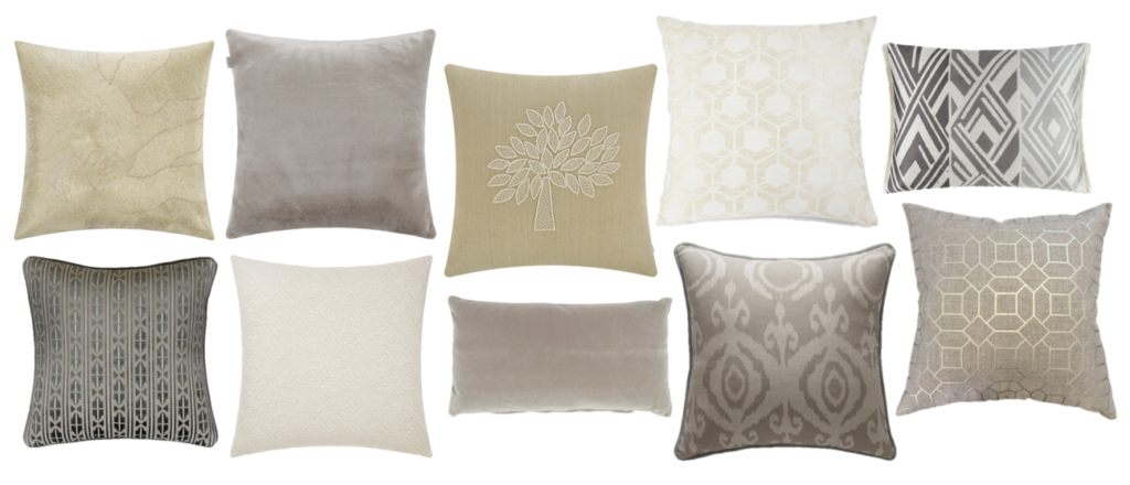 Top left to right: A by Amara – Bienville Cushion | Etro – Sagy Faux Fur Cushion | Mulberry Home – Crafted Mulberry Tree Cushion in Ivory/Sand | M&S – Hexagonal Geometrical Print Cushion | Designers Guild – Valbonella Cushion in graphite | Bottom left to right: Andrew Martin – Pelican Storm Cushion | Kenzo – Iconic Cushion Cover in Sand | Soho Home – Monroe Oblong Cushion | Andrew Martin – Volcano Canvas Cushion | Kelly Hoppen Home – Chiswick Linen Cushion
It wouldn’t be my personal cushion edit without a metaphorical toe dip into a pool of neutrals.
As seen on the catwalks, the new neutrals extend from our trusted greys and cream to beige, greige, stone, subtle blush and taupe. We’re also celebrating soft metallics in every shade to build a classic base. Layering your neutrals is the key to understated sophistication, especially if you combine interesting textures and finishes. I love to mix these soft hues with denim, fresh greenery and ever-chic khakis.
Here’s a little ode to soft nudes and blush;
‘New Neutrals’ moodboard inspired by Valentino SS’18 (catwalk shot: Getty Images).
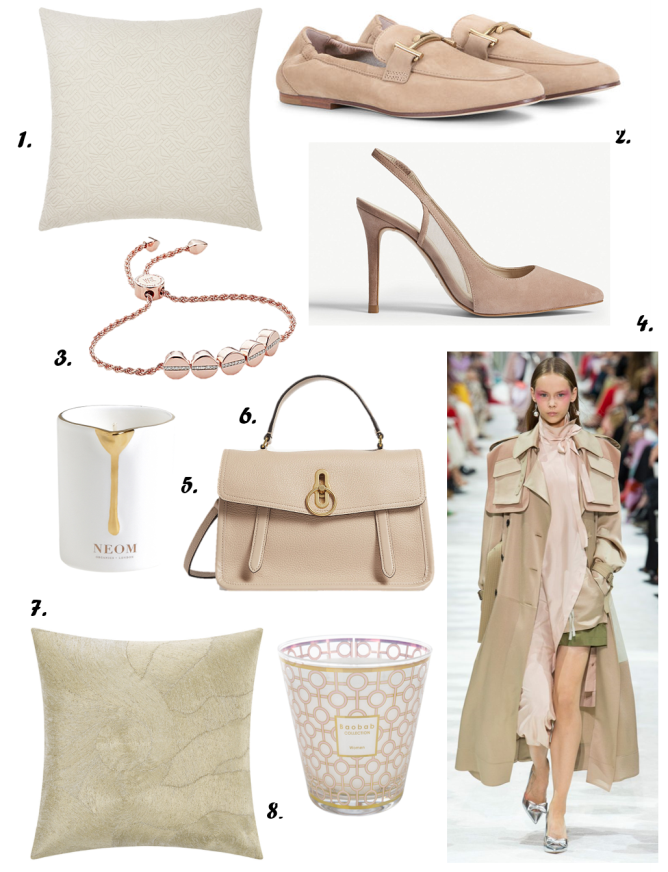 1. Kenzo – Iconic Cushion Cover in Sand | 2. Tods – Mocassins in Suede | 3. Monica Vinader – Linear bead 18ct rose gold-plated and pavé diamond bracelet | 4. Reiss – Clara suede slingback sandals in Blush | 5. Neom Luxury Organics – Skin Treatments Candle | 6. Mulberry – Gracy grained leather satchel in Rosewater | 7. A by Amara – Bienville Cushion | 8. Baobab Collection – Women Scented Candle – 16cm
CHOP & CHANGE
I hope that my well-stuffed cushion edit has given you inspiration for a playful, seasonal refresh!
Talking stuffing – or more specifically, the exciting subject of cushion inserts – I would always suggest opting for a 100% feather filling if possible. Foam just doesn’t quite make the grade here. A feather filled insert keeps cushions plump and far more malleable than foam, so you can karate-chop to your heart’s content! I like a dramatic ‘chop’ as it adds interesting lines and depth to your cushion collective. Trust me, you’ll never look back…

Which look is your favourite? Those brights certainly feel like summer, don’t they?! I’d love to hear your thoughts and please do share your interior updates, either in the comments below or on Instagram, tagging me @girlabouthouse.
Here’s to the dream of long summer nights, barbecues and beach walks!
Girl signing off,
Sarah x
 @2017 - Girl About House. All Rights Reserved.
7 thoughts on “YOUR (WELL-STUFFED) SPRING / SUMMER CUSHION EDIT”
I may now be divorced for this fabulous posting cushions want them All!!!!!!!
Speaking as a husband, quantity of pillows CAN be a problem….quality of pillows seldom is. 🙂
I love the brights! It’s funny, I was walking around debenhams the other day looking for a mother of the bride outfit for my mum, and the one thing that stood out in clothing, was the absolute burst of colour. Contrasting colours, they looked amazing! Though I don’t think I could pull them off with a growing bump! So I think I’ll stick to the monochrome delights for now.
But that doesn’t mean I can’t invest in some absolute beauties of accessories, like cushions and throws! I love these! Thanks for sharing!
S
Cushions are a great idea to renovate any portion of your house except kitchen. I and my husband both love cushions and other home decor accessories. I will try tri-color cushion now. Thanks for sharing such an amazing ideas.