TREND FOCUS: BRIGHT SUMMER FLORALS
Bold, bright, summer florals – effortlessly eye-catching, shamelessly loud, eternally happy. The high-summer must-have trend and perfect alongside our fortunate run of hot, balmy weather (downpours aside).
Floral prints kick about in one guise or another most seasons (I do love a dark-based, gothic winter floral during the colder months), transcending across fashion and interiors. This summer, florals are – once again – BIG BUSINESS. For more summer inspiration, check out my post on beach style interiors.
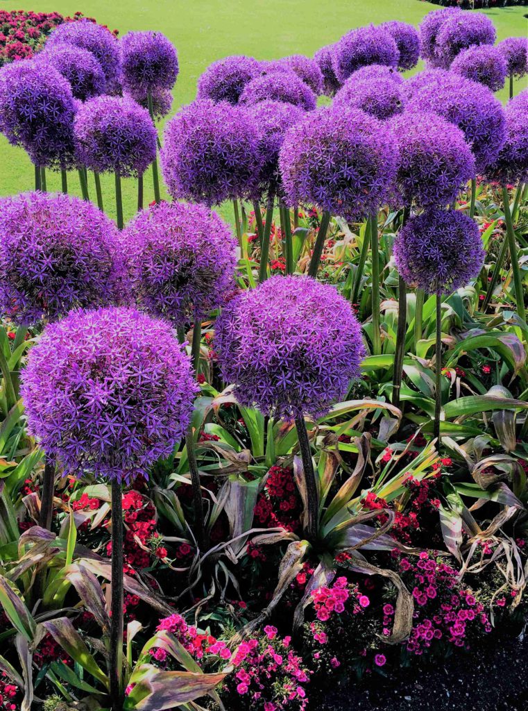 Kew Gardens is always a huge source of bright summer floral inspiration. The collection is beyond impressive and the colours are absolutely delicious!
KEY SUMMER FLORAL TRENDS
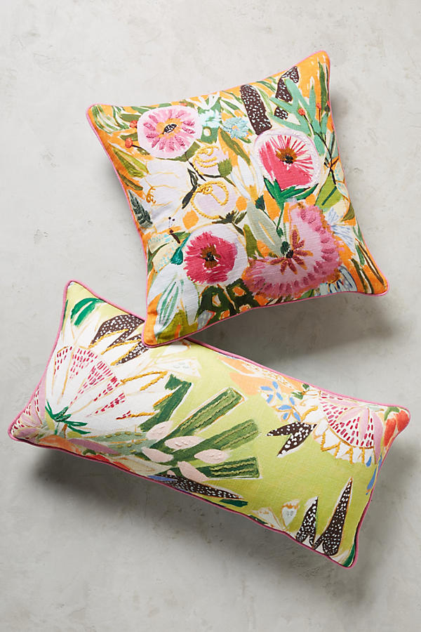
Like all trends, summer florals have had a little update this season – namely with embroidery. Folky blooms – embroidered and appliqued – have bombarded all areas of design and we just can’t get enough. Pretty, whimsical motifs have returned too; there’s a distinctive nod to English Country Garden parties and Primrose Hill picnics. Summer florals have also taken their influence from eastern climes, with stylised Oriental prints and palettes making an encouraged resurgence. We also see Mexican, Frida Kahlo-esque motifs in extravagant shades (M&S do this oh-so-well with their outdoor dining range).
M&S have got it so right with their Frida collection
The artist in me also thrives on the soft, painterly edges of the watercolour prints that have taken a hold. Essentially, think chalky, diluted Impressionist brushwork – Monet’s Waterlillies – with lighter tones. Anything with leisurely brush-marks and subtle gradients make the grade too. Bright, botanical blooms are also big on the scene, alongside William Morris styled decorative, spindly motifs. Additionally, the geo-floral – a ’60’s/contemporary hybrid – has resurfaced as modern and refreshed as ever.
SUMMER FLORALS: COLOUR TRENDS
Essentially, the key thing to note this year is that bright is back!
There are various clues to confirm this. A few years ago, interiors were domineered by grey/white – Scandi-inspired palettes and styling, clothes were de-saturated and roads awash with silver, white and black cars. Fast forward to summer 2017 where Greenery – a cheerful, Kermet the Frog hue – is Pantone’s Colour of the Year, car adverts showcase their latest vehicles in vibrant yellows and reds and we’ve gone gaga for 50 shades of pink! Bright, summer florals are perfectly in-keeping with our return to vibrancy and cheer. Woohoo! Mix vivid greens, turquoise and vibrant blues with on-trend pinks and yellows. The brighter, the better…
 Pantone’s Greeny is a vibrant colour and exemplifies our desire to go bolder and brighter
HOW TO INTEGRATE BRIGHT SUMMER FLORALS
As with all trends – even those which resurrect each year – I like to integrate with smaller pieces, accents and accessories. For interiors, this comes in the form of bedding, statement cushions, crockery and candles – ‘inter-changables’. I’m not personally for a statement floral sofa but I do applaud anyone who takes the plunge. For fashion, where the turnaround is faster, harder, more frantic, it isn’t a crime to floral-attack every element of an outfit. I, however, across both areas, always opt for a print/plain mix – that’s just how I roll.
Today, with the focus on interiors, this post will give you the ideas and know-how to succeed with summer florals this season. I’ve also curated a collection of absolute gems, alongside some ideas to help you integrate them into existing schemes.
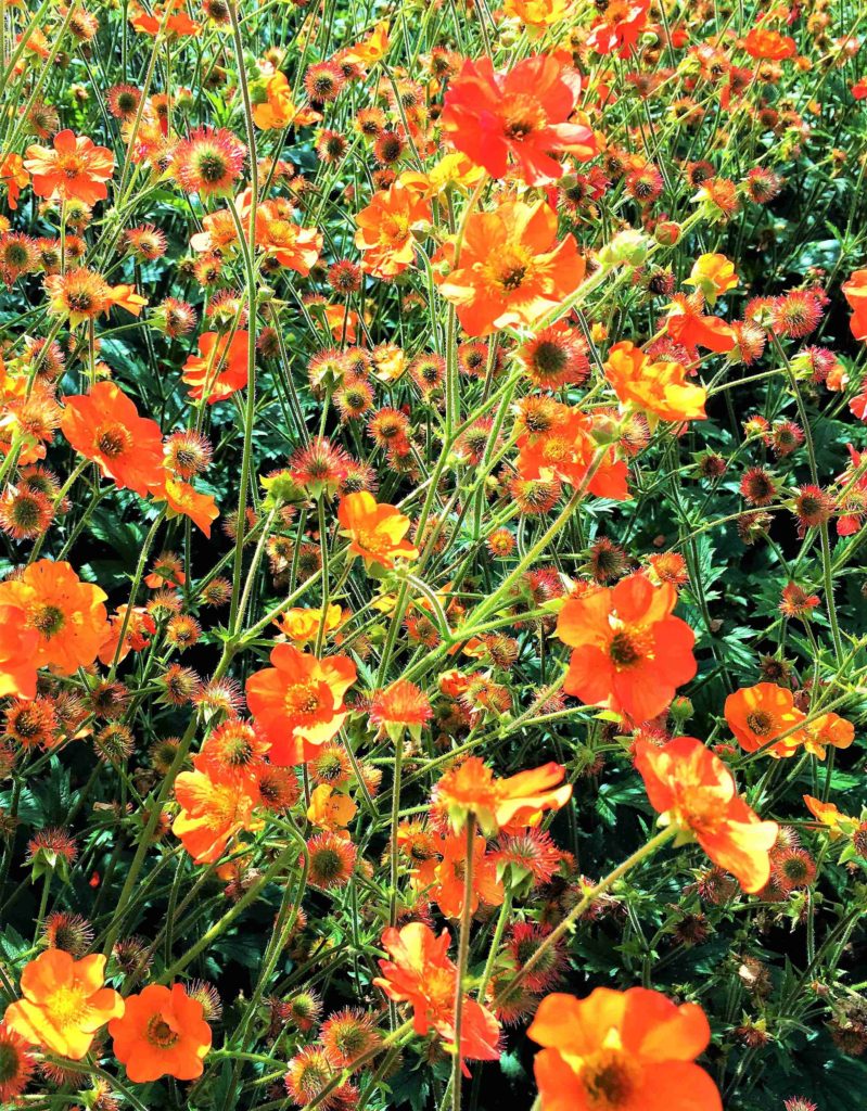 Orange hues at Kew
BRIGHT SUMMER FLORALS – THE NEED TO KNOW
M&S
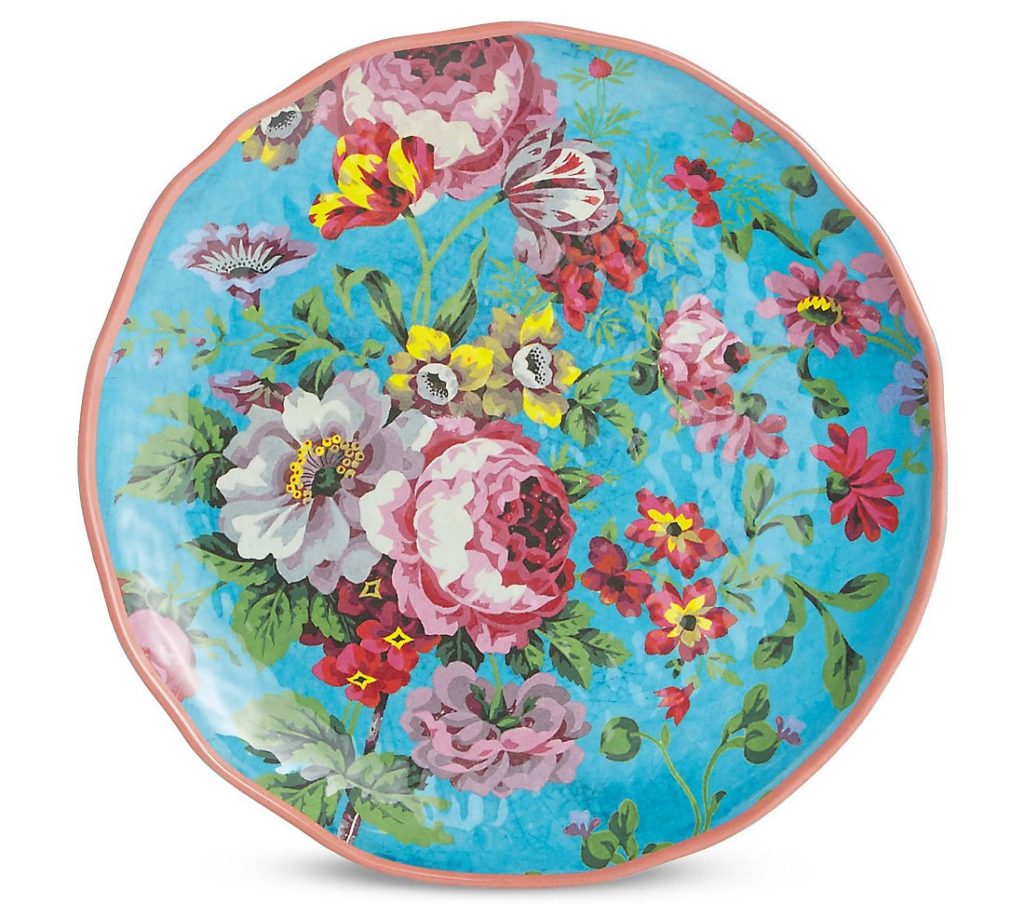
As I mentioned above, M&S are winning in this arena. One of my favourite high-street homeware retailers, their gorgeous outdoor collection is simply beautiful this season. The champions of their current collection are the ‘Frida’ plates. I’ve always been a bit Kahlo-crazy;
The organic edges, crackle-glazed effect and loud floral pattern really appeal to me. For an openly neutrals girl, this is a statement indeed. However, I do have a strong affinity to certain colours and this collection really ticks the boxes. It even transcends that I’m not even vaguely offended by the melamine material because the outcome is just so pretty – and ultimately, melamine is extremely useful for alfresco dining/ clumsy kids. (Win-win)!
TED BAKER
Ted Baker are prone to a bit of flower-power across both their fashion and homeware ranges and they certainly are ‘working it’ this season. Bright summer florals are the centre of their collection, with their beautiful linens seriously making me reconsider my current bedroom scheme (sorry husband)!
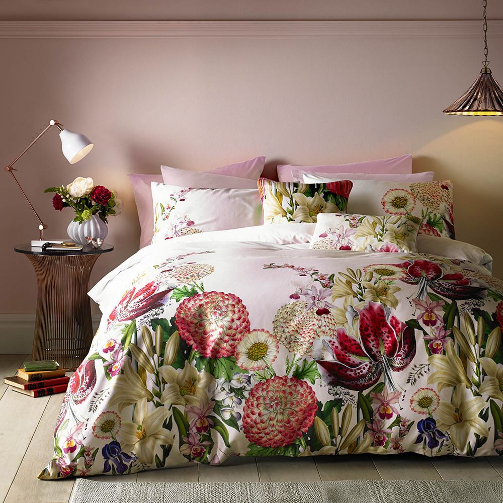 Image source: Ted Baker
ROBERTO CAVALLI
Roberto Cavalli never shys away from vibrant hues and dramatic opulence. This season is no different, except his floral game is exceptionally strong! His bedding is totally gorgeous but if it’s all too much, pare it back and accent with an extravagant statement cushion. Pick out a key colour from the print and use that as the basis for your scheme – be it some plain bedding or your wall shade. A dusky pink or pale, stoney shade would work a treat in contrast.
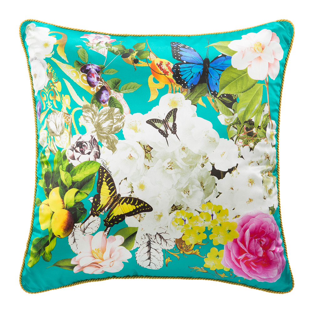 Roberto Cavalli Blaze Silk Bed Cushion in Teal
I love the combination of vibrant photographic florals with pretty lemons and butterflies. This is a celebration of nature at its finest! The contrasting, twisted piping amps up the drama too!
PIP STUDIO
With their ditzy prints and pretty palettes, Pip Studio is a go-to brand for floral fanatics. This season, they’re brighter, bolder, whilst maintaining their signature illustrative flavour. This Chinese Garden yellow wallpaper would look amazing in a sunny dining room!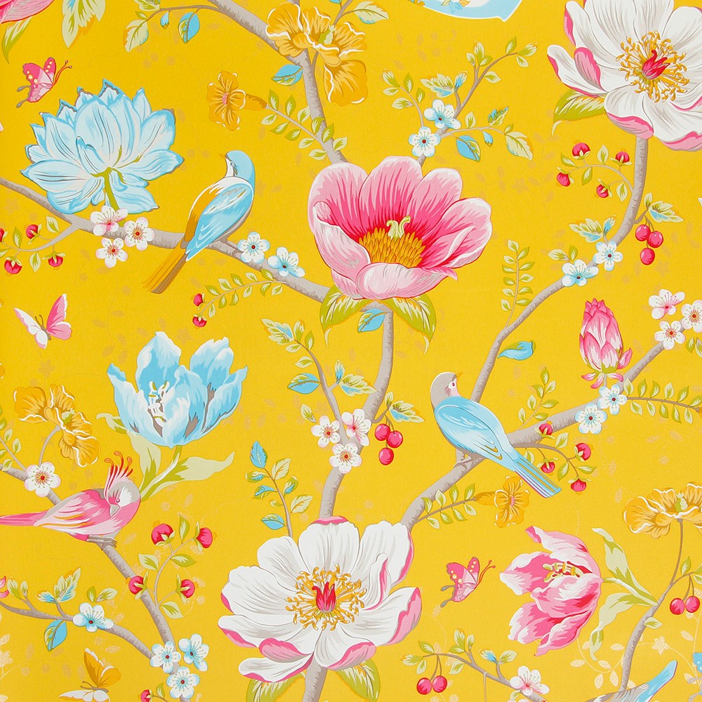
Inspired by floral blooms; oriental peonies, chrysanthemums and lotus flowers, its vibrancy and optimism is contagious.
DESIGNER’S GUILD
I couldn’t really do a floral round-up without the mighty colourful force that is Designer’s Guild. Their collaboration with Christian Lacroix has proven extremely successful with some strikingly beautiful outcomes. This rug, which features a bright trellis motif, accented with blue/green florals, is seriously cool. It feels a little bit ‘jungle’, a little ‘Victorian Avery’ but is totally awe-inspiring! Elevating it even higher in the style stakes; the effortlessly chic styling. As featured below, the busy, ballsy design looks fantastic within a traditional setting – indeed, this is parquet and panelling perfection.
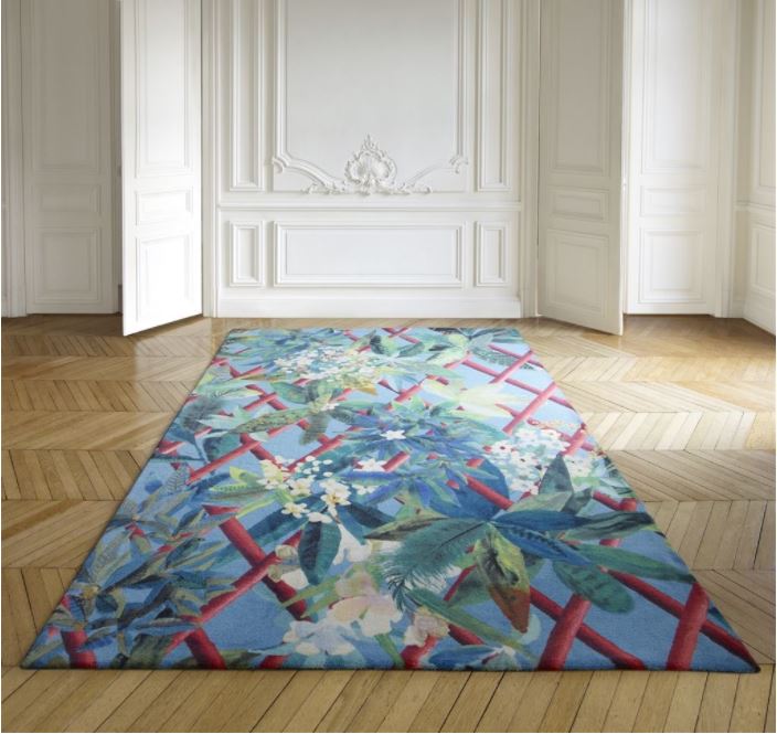 Image source: Designer’s Guild
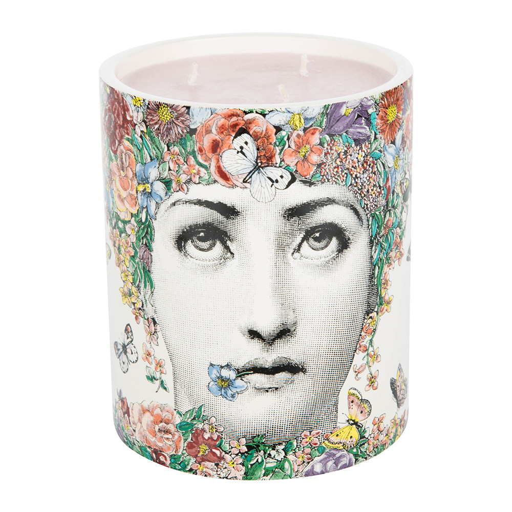
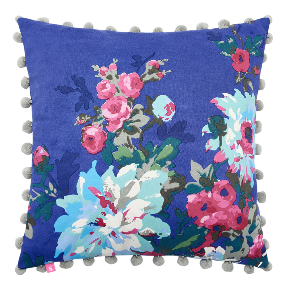
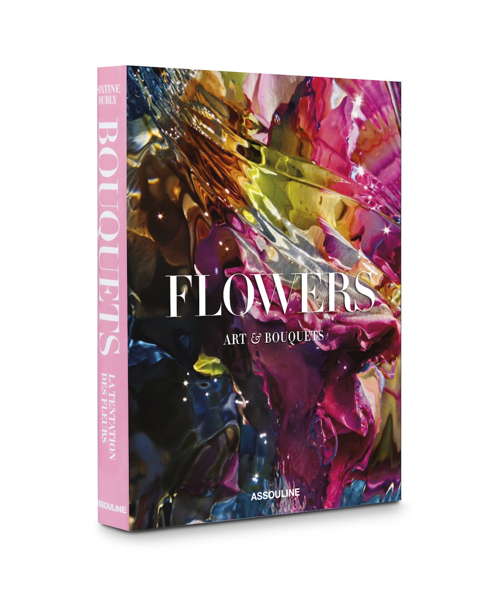
BRIGHT SUMMER FLORALS – SHOP THE LOOK
Hopefully this bright summer floral treat has whet your appetite. There are so many sunny blooms to enjoy and they look simply gorgeous alongside our trusted neutrals…
Are you a fan of flower power? Tweet me, catch me on Instagram or the GIRL ABOUT HOUSE Facebook page and let me know your style preferences. I’d love to see images of your floral styling too. Alternatively, leave me a little message at the bottom of this post and make sure you subscribe below for the latest updates!
Girl signing off,
Sarah x






 @2017 - Girl About House. All Rights Reserved.
5 thoughts on “TREND FOCUS: BRIGHT SUMMER FLORALS”
Absolutely loved this!