
HOW TO CHOOSE THE PERFECT PAINT COLOUR FOR YOUR INTERIOR
With September around the corner, it’s almost impossible to escape that inevitable ‘back to school’ feeling. The apprehension of the unknown, married with that giddy excitement of a ‘fresh start’. Even if you’re nowhere near a classroom, I always think there’s a real sense of ‘newness’ in the air around this time of year.
Exciting trends surface – new shapes, fabrics, colours – and there’s always a big thrill in shopping autumn/winter. (At least for me, anyway). It’s the perfect time for reinvention. The ideal opportunity for a new look – both in terms of personal fashion and styling but also extending to our homes.
 British Vogue’s infamous ‘September Issue’ celebrates that it’s ‘out with the old and in with the new’! As with fashion, interiors embrace exciting and fresh new trends too
If you’re looking for a dramatic interior update then consider a fresh wall colour. New paintwork is quick, easy, relatively cost-effective and a great way to spruce-up your space. If you’ve been staring at your grimy c.2008 Magnolia walls with contempt, the likelihood is that you’ve considered a new colour scheme for a while. Often, there’s one (big) barrier between the greatest of intentions and action – choosing the perfect paint colour.
PAINT – THE FOUNDATION OF YOUR SPACE
Firstly, don’t stress. It’s only paint, after all, and if you misfire the first time – try, try again. Fortunately, I’m here to guide you through the process and give you some sound, professional advice to make your walls sing.
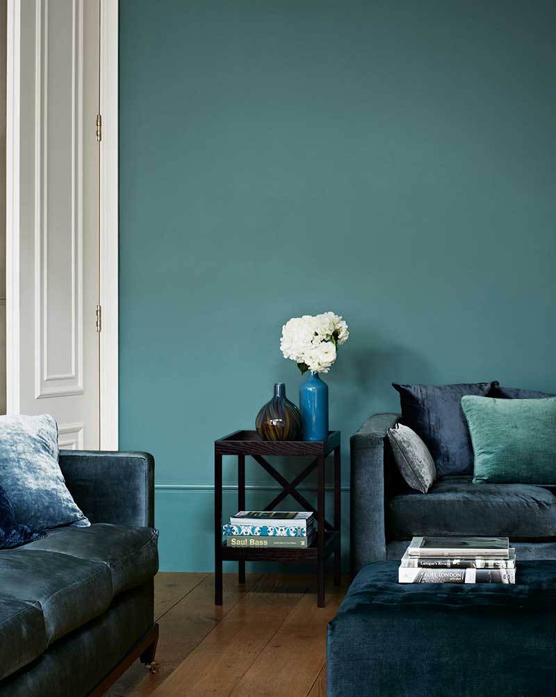 This image from Zoffany sees rich shades of blue and green work harmoniously to create a dramatic impact in this living space
I cannot stress enough that, although important, the wall colour you choose is not the be-all-and-end-all of your scheme. It’s one cog in a complex machine. It does play an integral part in helping achieve the desired look and feel but it isn’t the defining factor.
Much like a good foundation or a classic white tee, think of your wall colour as a base. Ultimately, it’s how you dress it up (or down), layer and embellish that really shapes the final look. Also, note that the wall colour will be directly affected by what sits within and outside of the space. How it is styled will have a massive impact too, so never judge it entirely out of context.
To really gage the success of a paint colour, consider how it works within and complements the overall setting.
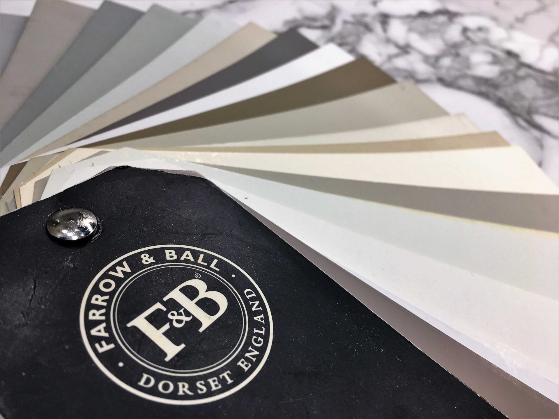
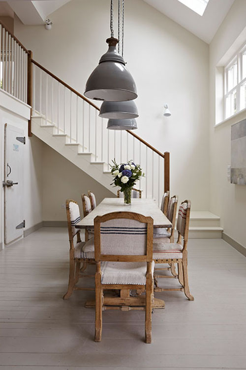
 Farrow and Ball’s rich ‘Charleston Grey’ is considered within an overall scheme here. (Image source: Sarah Mailer Design)
It can be frustrating and time-consuming making a decision, despite your best intentions. Endless inspiration boards on Pinterest and Houzz, paint sample splodges scattered across the walls, tins aplenty. If only all that time researching, testing, deliberating could be condensed…
 Pinning can be great fun but also somewhat overwhelming…
WHAT IS THE PERFECT PAINT COLOUR?
Surely the dream is to choose a colour, try one easy-breezy tester, LOVE it and then glide it all over your perfectly primed walls. It would be a colour that is just perfect. Sublime. A shade that enhances every aspect of your space – indeed, your lives – and which creates the ideal setting.
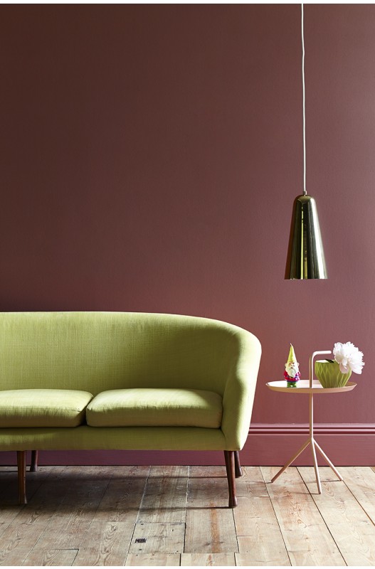 This Little Greene image showcases how the right wall colour can give your space real finesse. Here they’ve paired a warm rose shade with citrus accents
Unfortunately, choosing the perfect paint colour isn’t a one-size-fits-all exercise. It can’t be. There are so many differentiating factors. However, if you note all the variables and answer some key questions, the selection process will be far more pain-free.
Here are some things to consider when selecting the perfect paint colour:
- Personal preference
- The function of the space
- Natural and artificial lighting
- Existing flooring, furnishings etc.
- Design trends
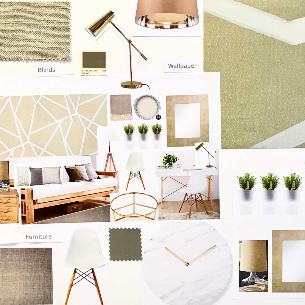
 Dulux demonstrates how a scheme’s concept can be visualised in a mood-board and then realised
PERFECT PAINT COLOUR FACTOR 1 – PERSONAL PREFERENCE
Who doesn’t love a Pinterest board (see mine here) or a glossy magazine showcasing the latest styles and interior trends? It’s just so exciting to dip into the world of exquisite design, collate ideas and draw inspiration on an enormous scale. However, the key thing with creating an effective space – first and foremost – is to design for YOU.
As much as we experience and respond to the latest looks and trends (more on this later), personal style and preferences should play a key part in your perfect paint colour selection. It’s really easy to be influenced by others’ schemes or to try and cater to what’s ‘in’. Further to this, property shows have historically dissuaded us from being brave and adding personality by preaching the myth that anyone buying your home is looking for a totally blank canvas. In reality, a bit of personality goes a long way!
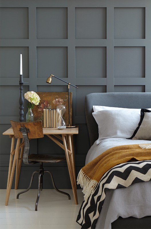 This gorgeous image from Little Greene showcases the success you can have with dark panelling, if balanced correctly with other elements in the space.
For me, the key is balance. I tend to enjoy mixing versatile neutrals with pattern and colour. And, as much as dark and moody might be the order of the day, I do really LOVE a neutral wall – a restrained backdrop. That’s just my personal style.
However, if you’re drawn to a less universally appealing wallpaper or vibrant colour, then use it as the base of your scheme and just go for it! If you really love bold print and vibrant pattern and have a key piece you wish to include in your space (e.g. a rug) then it’s often worth picking a paint colour from this. If you don’t want to go too bold then pick a lighter tone of the colour you’ve selected for your walls.
PERFECT PAINT COLOUR FACTOR 2 – PURPOSE/ROOM FUNCTION
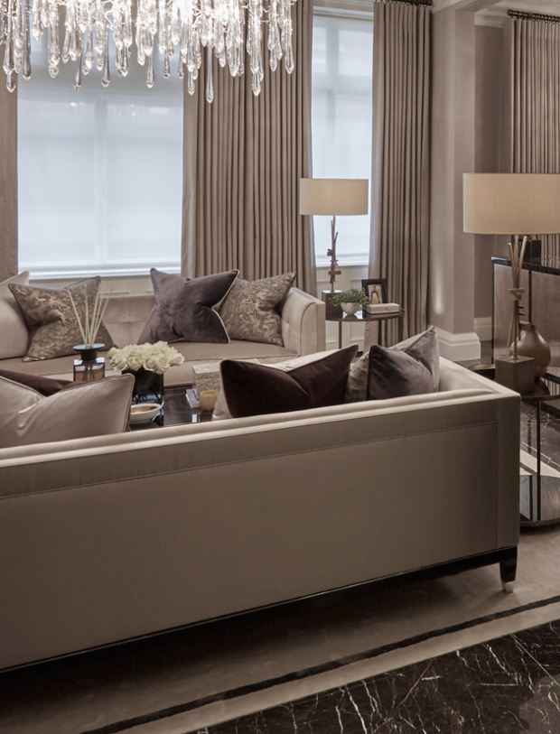
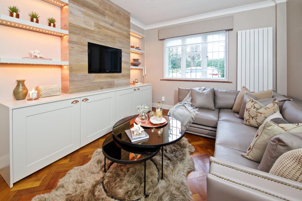
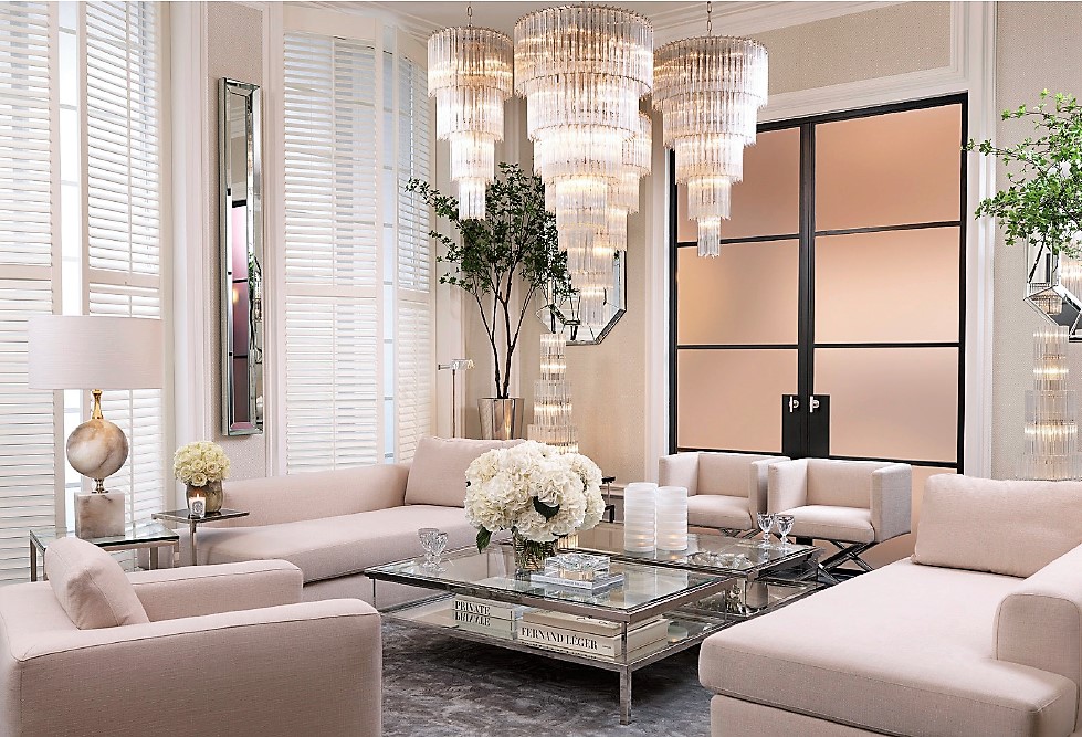 This fabulous Eichholtz lounge really captures the classic contemporary, timeless elegance that I strive to achieve in my more formal schemes with a classic palette and neutral backdrop
When selecting the perfect paint colour, a key factor is to consider how your space is used. This will have an effect on the overall colour scheme too. If it’s a kitchen or other ‘daytime room’ you may wish to make it bright and airy to give it an open, sociable feel. You can do this effectively with light, bright paint on the walls.
Greys have been staple neutrals for some time now and are still going strong. I like pale, warm greys or really light nude/taupe shades for these type of ‘daytime’ spaces. Farrow and Ball‘s ‘Ammonite’ or ‘Cornforth White’ are such easy shades to work with.
If you want to go for something a little different, then pale pastels are a great alternative. Just be sure to avoid anything too sweet if you want to maintain some maturity.
BEDROOMS
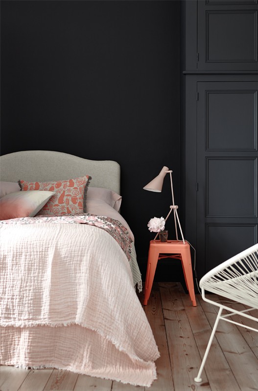 Dark, moody walls with blush and coral. (Image source: Little Greene)
Bedrooms, which are more private spaces, tend to have the intent of feeling more relaxing, intimate and calm. A darker palette often works here or a light palette with warmer undertones (reds, caramel, golds). I am a fan of warm truffle or taupe shades across walls, with dusky pinks or duck egg blues also favourites to induce sleep. Anything too crazy, bright or loud in a bedroom can have the opposite effect, so use vibrant accents more sparingly. That said, there is something quite indulgent, appealing and fresh about all-white schemes. Crisp white bedding also always works a treat for an inverted ‘pop’ against the darker foundations of a space.
For children’s bedrooms, you may work around a wallpaper or key colour e.g. pink to give the space a thematic feel. Feel free to channel a bit more saccharine here – age-dependent.
LOUNGE/DINING ROOMS
 Gorgeous warm tones at Louise Bradley Interiors, offset with beautiful bronze accents
Evening rooms e.g. more formal lounges or dining rooms, also lend themselves to slightly darker, richer tones. It’s more fashionable than ever to embrace Prussian blue, clay-coloured grey-browns, berry, mink or emerald green on walls in these sort of spaces, accented with statement lighting in metallic finishes. Bronze, brass and coppers work beautifully with these shades, creating an expensive, opulent feel.
PERFECT PAINT COLOUR FACTOR 3 – NATURAL AND ARTIFICIAL LIGHT
Whether your room is north, south, east or west-facing makes a huge difference to the light quality and endurance in a space. This is something that should never be overlooked. The amount of light and it’s direction can transform a colour entirely. The same shade can have incredible warmth and depth in one room yet look terribly lacklustre in another.
In terms of artificial light, the type of bulb or light source can also dramatically impact the wall colour you select.
 This Little Greene scheme shows how you can incorporate playful accents into your home with paint and colour
NORTH-FACING ROOMS
North-facing rooms have the most sustained quality of light. This is great for art studios (and perfect for me, when selecting samples) because the colour of the light will alter the least during the course of a day. It may sound a little mad, but the colour of light does change quite dramatically throughout the day. (Think vibrant sunshine in the morning vs an early evening hazy glow).
North-facing rooms offer a more blue-tinted light (in the Northern Hemisphere) and can feel quite cold. To counteract this chilly feel, you should ideally select a wall colour with warmer elements (e.g. red undertones) and avoid blue undertones.
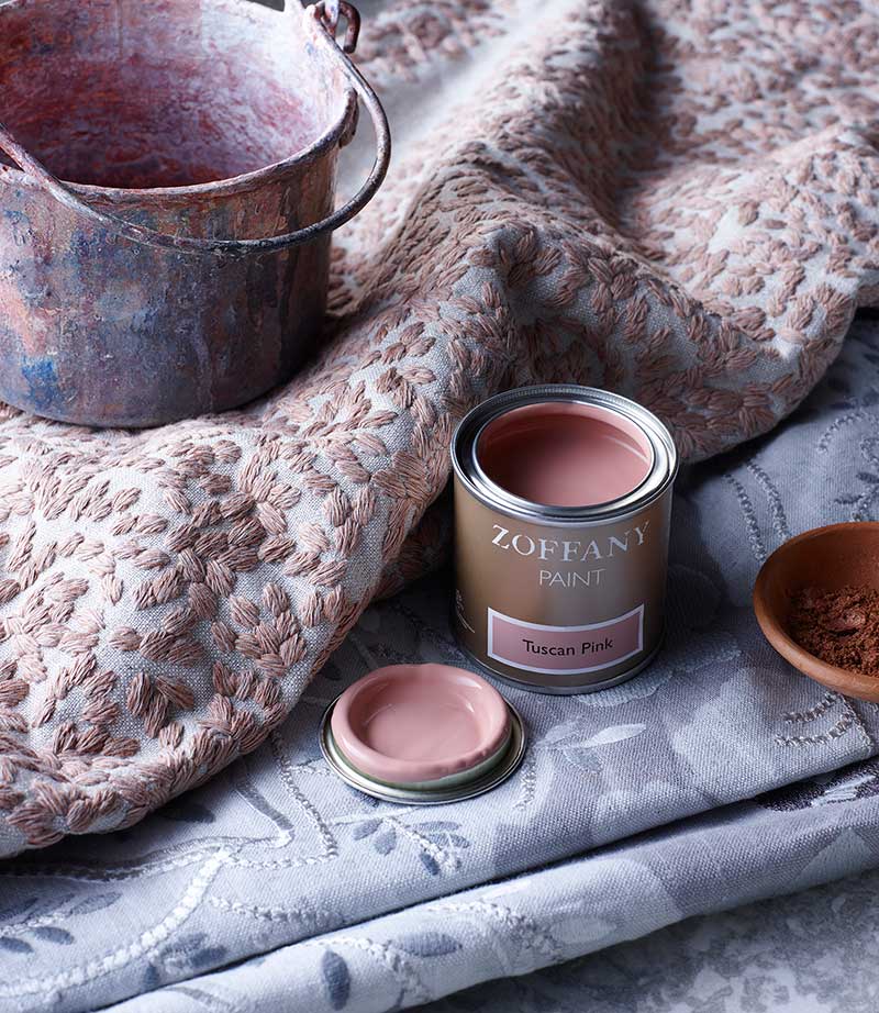 Warm Tuscan Pink would really sing in a south-facing space but is also a perfect shade to balance the cool light in a north-facing room
North-facing rooms can also feel quite gloomy. There are some schools of thought which encourage embracing the gloom. Sticking with darker, muddier tones – not fighting nature. I however, like to counteract a dull space with sunny accents of chartreuse, yellow ochre, warm greens and golds.![]()
![]()
SOUTH-FACING ROOMS
Sunny, bright and inviting, south-facing rooms offer a very exposed stream of sunlight. Offering the most versatility in terms of colour selection, both warm and cool colours work really effectively here. You can use almost any colour and it will be flattered by the light. It is important to note, however, that walls can look quite harsh in bright, Brilliant-White. Ideally, opt for slightly softer shades to reduce the severity and glare.
 A soft-white shade works better than Brilliant White in this classic-contemporary lounge (Image source: Little Greene)
EAST AND WEST-FACING ROOMS
East and west-facing rooms carry light throughout the day but see the most change. It really is amazing how light acts as nature’s paint. When you are sampling wall colours, paint large swatches onto lining paper (two coats minimum) and tack to different walls at different times of day to evaluate the effect. The variation can be quite astounding.
Due to the extreme changes in light, when you use the space should help determine your perfect wall colour. In east-facing rooms, where the morning light is warm due to the sun rising and light cooler as it sets, decorate it as you would a south-facing room in the morning and north-facing in the evening. Reverse this for a west-facing space. If you use the room all day, aim to mix both warm and cold colours,which will complement and flatter the changing light.
ARTIFICIAL LIGHT
 Lighting can make all the different to your wall colour or paint scheme so choose wisely
A warm or cool white bulb will dramatically alter how you see a colour within a space. I personally love warm white, which is softer, more flattering and less severe. Expect a slight yellowish tint, which can make some colours look a little ‘dirty’. You can afford to go slightly more purple/blue on the walls with a warm-white light, as the yellow-haze will warm cooler tones.
Cool white bulbs are brighter and more extreme. They can have a slightly blueish quality which sometimes gives me a ‘fish tank’ feeling. I don’t love them as much – largely for this reason – but they do serve their purpose in kitchens or more ‘functional’ spaces. They can make spaces appear more ‘blue’, so colder undertone shades of paints can feel even frostier in this environment. If you insist on cool white bulbs then warm up the space with red undertone paints.
PERFECT PAINT COLOUR FACTOR 4 – EXISTING FURNITURE AND BUDGET
 If grandma’s vintage table and chairs are a permanent fixture then your scheme should work successfully around them. (Why are real ‘family heirlooms’ never this beautiful eh, Farrow and Ball)?
We can’t all start from scratch with a space. Sometimes, half the fun is working around existing pieces that are totally non-negotiable. Pieces that have to stay – often for sentimental or budgetary reasons – do restrict the selection of a colour scheme but also ground the design. As above, using key pieces as the basis of your colour scheme is often the best approach. If you love a piece of artwork, for example, use a colour – or colours – from it to define the overall palette. I tend to go for lighter shades of the chosen colour, largely because I prefer a more subtle ‘base’ on the walls but the world is really your oyster.
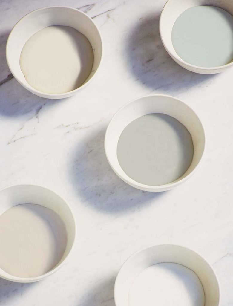 The most subtle changes in shade (colour) and tone (light or dark quality) can make a big difference within your space
If you are looking to find a range of shades derived from a particular colour, then both Dulux and Little Greene are fantastic go-to brands. They offer lighter and darker versions of their key shades of paint, which is great if you’re looking to create seamless tonality between floor, walls, woodwork and ceiling.
I also really like B&Q’s own Valspar paint range because it offers a diverse colour palette and you can view their painted colour swatches under different lights. This will help you immediately in building an accurate picture of how the colour might look in your own space.
You can achieve lighter tones of any colour by mixing yourself. If you add white, it will create a lighter tint of any shade. The downside to this approach is that directly mixing in white can result in a more ‘chalky’ quality to pigment and it can also be difficult to recreate perfectly, should you require more.
PERFECT PAINT COLOUR FACTOR 5 – NEW TRENDS
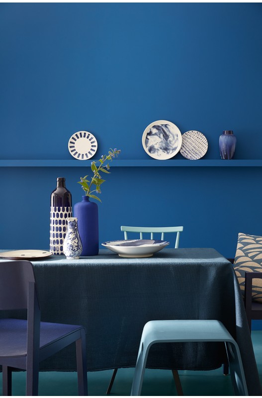 All the blues – so rich and on-trend
As with fashion, interior trends are ever-changing, re-inventing and evolving. Similarly, interior design is shaped by trend-forcasting, social, political and economic factors, celebrities (think Kardashian style) and social media such as Pinterest or Houzz. Additionally, colour authorities, such as Pantone, release a colour of the year each December for the preceding year, which gives a flavour of things to come.
A/W 2017 TRENDS
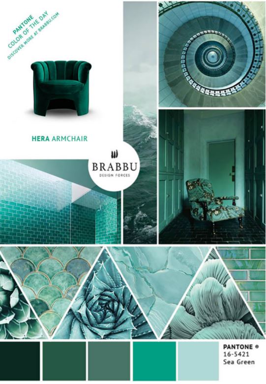 A Sea Green mood-board, highlighting a key colour for A/W 2017/18 (Image source: Brabbu)
There are long-standing trends which are still rife in 2017 – think grey – and more faddy ‘micro-trends’ which make less of a sustained appearance in design. This is across both fashion and interiors and into beauty, branding etc.
Pink – in several guises – has made a complete resurgence (see my recent blog post on fashionable Millennial Pink here), alongside mixed metallics. (You can read my post on copper and rose gold here). We’re also currently seeing a lot of love for greens (Greenery is Pantone’s current colour of the year, after all), yellow – with Ochre and the lime-tinted Chartreuse key players, plus navy and Prussian blues beautifully offset with crisp white. With all things ’70s trending, rich berry, camel and burnt orange/terracotta shades are reappearing with renewed vigour and purpose.
Greige – the close relative and warm hued side-kick of our trusted grey (think a grey/beige hybrid) – is a new easy-neutral classic shade worth considering. It works a treat with most accents, whilst looking luxe and expensive. I really do have a thing for Greige at the moment as it’s so versatile and can be classier than a gritty urban grey. It also looks particularly gorgeous paired with blush, copper and coral shades.
 A scheme combining warm ‘greige’ walls with taupe, linen and copper shades at Sarah Mailer Design
If you want to embrace a fresh trend colour, I wholeheartedly support you but with one small request – please refrain from a 2009 ‘feature wall’! The new way to mix and match is to contrast the woodwork, make a feature of the floor or paint out the alcoves either side of a chimney breast. If you do this, consider using a darker tone which helps to recess the space so the room feels bigger.
If you insist on using ‘feature wallpaper’ then aim to blend it with the surrounding walls so that the transition is more subtle. This, I am very much on-board with!
 Cole & Son Marquee Stripes make a striking statement. This can be used all over or blended with the rest of the scheme. (Image source: Cole & Son)
ACHIEVING WALL COLOUR PERFECTION – TEST, PREP, PAINT
As discussed, testing your wall colour – on a number of walls, day and evening – is imperative in ensuring you get it right. If you follow the guidelines above, you will be much closer to ensuring a winner (I promise).
The perfect wall colour is merely some tester pots away…
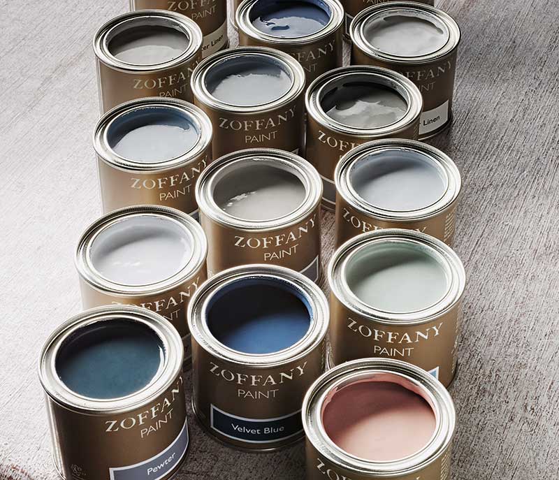 Tester pots at the ready! (Image source: Zoffany)
Also, remember to ensure you’re painting over a colour appropriate base coat too. Historic layers of paint sitting underneath a fresh coat can dramatically alter how a wall colour is perceived. More on this in another post.
I said at the start that I would be dipping into this vast topic; I am very aware that it has been a mere toe-dunk (mega word-count aside). However, I hope that I have offered you a helpful insight into selecting the perfect paint colour. I will certainly be answering the FAQ ‘How to pick the perfect shade of grey’ very soon.
 Grey-dreaming. The perfect grey will be explored in a future post…
Please do subscribe to GIRL ABOUT HOUSE’s mailing list to ensure that you are up-to-date with all the posts, advice, latest trends and wish-list products. Also, catch me on Instagram, Facebook, Pinterest and Twitter to stay up to date across London Design Week (LDW) 2017!
Girl signing off,
Sarah x
P.s. If you haven’t done so already, please don’t forget to vote for GIRL ABOUT HOUSE in the Amara Interior Blog Awards 2017. Here’s the link: VOTE GAH
 P.p.s. All this talk of ‘fresh looks’ and style updates gave me the sudden urge to ‘radically’ alter my look. So I had a haircut. This is short (for me)…I feel lighter already! Thanks for reading xx
 @2017 - Girl About House. All Rights Reserved.
10 thoughts on “HOW TO CHOOSE THE PERFECT PAINT COLOUR FOR YOUR INTERIOR”
Thank you for this. So many awesome ideas for my new apartment. Can’t wait!
Great advice. Have an interior co specialising in bespoke mirrors, https://m.facebook.com/MontysMirrors/
Take a look, 30 years in business, next to Crews Hill station, En2 9ds
Thank you for posting this useful information and sharing this vital info. Wonderful explanation
Hi please can you help. I have a west facing kitchen with traditional oak units . I’ve just painted the walls in french grey little green company and its a great colour but it’s not right any suggestions .would be much appreciated .