
11 COLOUR TREND PREDICTIONS FOR 2018
RESOLUTIONS, GOALS & NEW COLOUR TRENDS
It can’t still be January, can it?! Almost a full month in and it continues to feel very much like December’s hangover – that morning after the night before. Apologies for the extended silence. I’ve not only been detoxing from all the glitter but I have been really busy, beavering away at some exciting new projects. The excess and festive frivolity of 2017 is all but a distant memory now. And I’m okay with that. A new year encourages new beginnings and fresh starts (even if the diet failed miserably on January 3rd)…
Today, I’m focusing on colour – shiny, new colour trends for 2018. By no means a definitive guide, below are my 11 personal predictions for the year ahead. And whilst you don’t have to take this as gospel, I do expect some of the following to be BIG BUSINESS. Are you ready for a change? Brace yourselves…
COLOUR TREND #1. HELLO COLOUR
 Orange accents speak volumes. Image source: Sarah Mailer Design
First and foremost, heed my words – 2018 is bringing the colour!
We’ve certainly seen vibrant hues burst onto the catwalks, into car showrooms, the pages of glossy magazines and trend showcases. So many avenues of contemporary life have been infiltrated by vivid colour – and about time too. We’re all but bursting out of that grey area! With Pantone pushing this agenda through their announcement of ‘Ultra Violet’ as 2018 Colour of the Year it’s official – colour is BACK!
That’s not to say that our trusted grey is going anywhere fast (it’s just too much of a staple, especially strong charcoal and elephant shades) but we should all expect more colourful collaborations as we push forward. For all you neutral fans (and some a little scared to deviate from grey), now is the time to champion a delicious colour-pop through smaller accents.
COLOUR TREND #2. THE NEW NEUTRAL – GREIGE
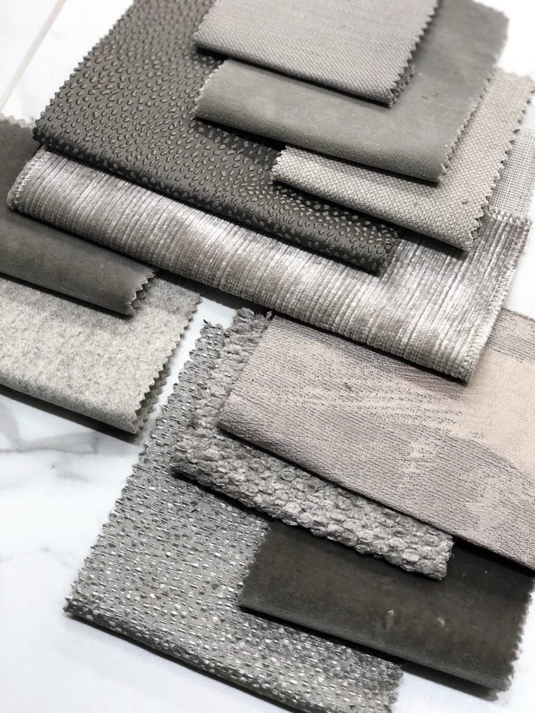 Greige: Fabric swatches
Whilst some trend prediction posts have ousted neutrals entirely, I will ever be an advocate. Neutrals are just so incredibly useful, versatile and reliable, whether you’re building an outfit or an interior scheme. Yes, bright colours are certainly on the up but it’s no big secret that grey has been our oh-so-easy neutral for some time now. Magnolia’s smug successor.
However, whilst grey seemingly maintains its unfaltering popularity, we are beginning to seek more warmth from our neutrals. All rise for GREIGE. It’s the ultimate neutral hybrid. A welcomed mix of grey and beige, it will fast cement itself as our trusted neutral for 2018. This is one colour trend that will be sure to stick around for some time to come.
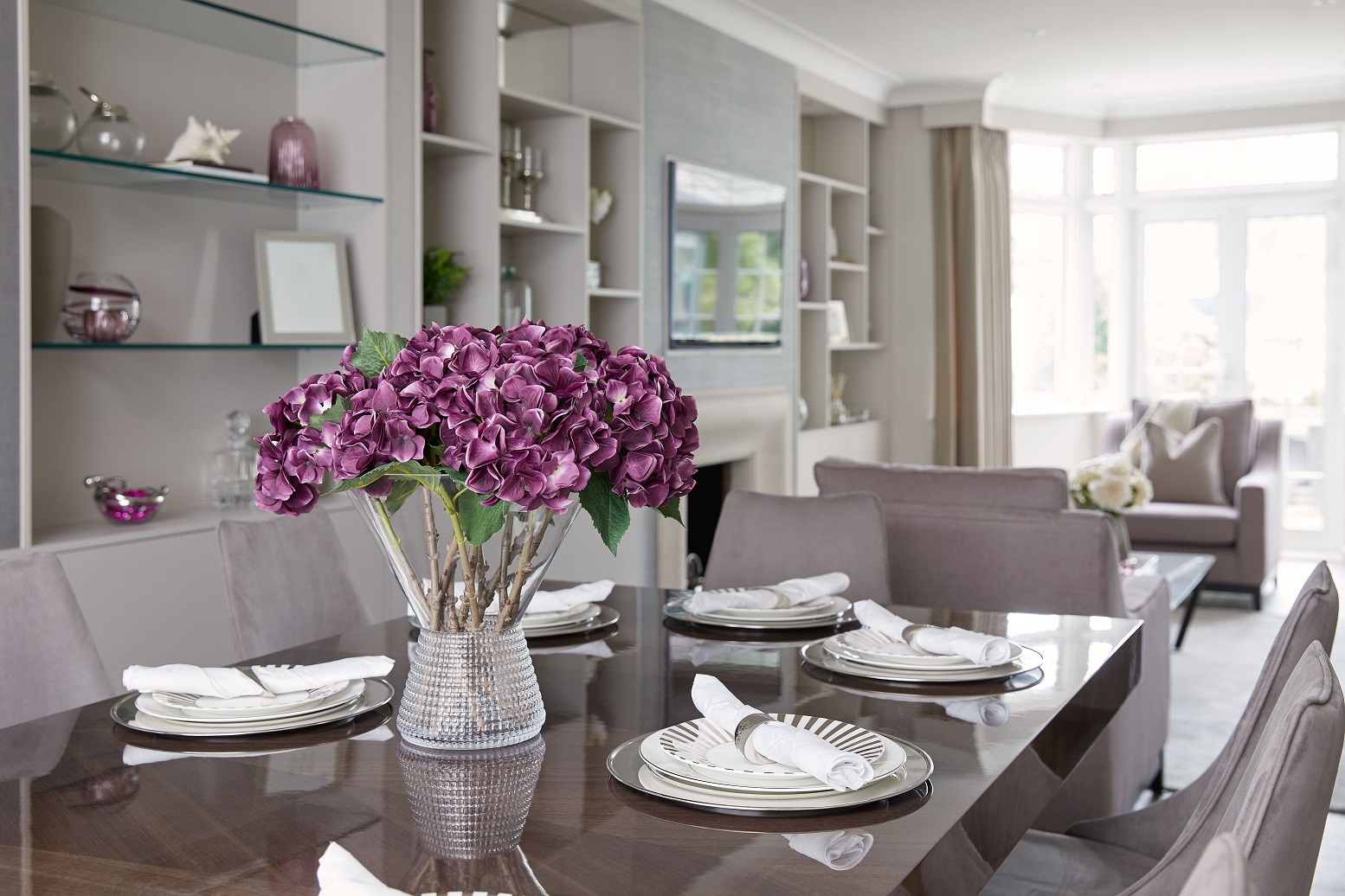
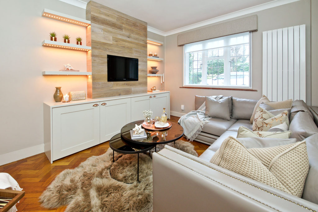 Gorgeously greige TV room. Image source: Sarah Mailer Design
Greige bridges the gap between contemporary grey and classic beige – a shade which has had a very bad rap of late but which is actually incredibly versatile and warm. Greige maintains grey’s cool vibes whilst offering a friendly hug through its beige/brown undertones. It is easier to work with than grey – coordinating almost effortlessly with most colours – and I personally feel it can look more expensive and sophisticated than its slightly frostier counterpart.
When thinking greige, consider grey with a hint of brown. And try not to be scared off by the word ‘brown’. Beige and browns have begun creeping back into our lives, and I, for one, wish to embrace this wholeheartedly. Are you with me?
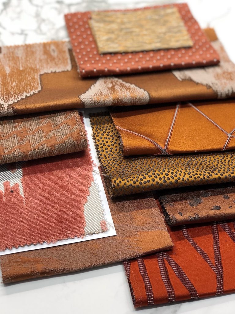
COLOUR TREND #3. THAT ‘70s SHOW
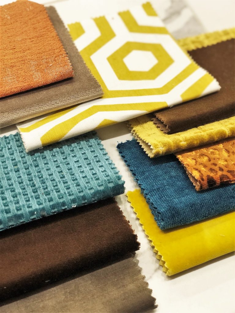 The ’70s Show: Fabric swatches
We’ve already seen the start of this trend which surged in popularity last year and will long continue into 2018. The ‘70s is certainly owning its moment. We’re lusting over sunken lounges, velvet and corduroy, heavy texture, coloured glass and drinks trollies… Even serving hatches are teasing at a revival.
This funky flavour extends to colour palettes too. As I mentioned above, prepare yourselves for the beginnings of the return of brown. Additionally, celebrate yellow ochre, truffle, camel, burnt oranges, red, turquoise – small accents or combined, if you can brave it. Expect to see strong, bold colour injection in 2018. Social, political and financial uncertainty often bring with it shorter skirts, more frivolity with fashion and, in my opinion, colour experimentation. We have to maintain some fun, right?!
COLOUR TREND #4. PURPLE REIGN
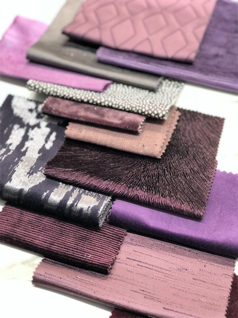 Purple Reign: Fabric swatches
Pantone’s announcement that Ultra Violet would be the colour of 2018 did not come as a total shock to me. Whilst I personally find this shade a little brash and gaudy, purple has been gaining popularity for some time now. Unashamedly ‘70s – Prince would be proud – Pantone’s select hue also has a space-age, futuristic feel which seems totally relevant at this juncture. Whilst our sustained love of personalisation confirms our nostalgia, the explosion of crypto-currency and technological advances highlights our embrace of the future. Ultra Violet ticks all the boxes.
That’s not to say it’s the only shade that matters. Embrace purple in its many guises; from regal and berry tones to amethyst and soft lavender. For a statement, pair with gold or yellow – think complimentary colours – but equally tone with browns, greys and greige. For now, we’re only at the coronation – expect this trend to gather even more momentum.
COLOUR TREND #5. GOLD RUSH
 Gold Rush
An extension of yellow – which has soured in popularity – brass will be the metal of choice for 2018. Whilst copper had been championed until recently, and all metallics are still extremely popular, golden hues take the crown. All you grey advocates; switch up your chrome finishes for brass and inject a new lease of life into any scheme!
I’m a huge brass fan as it adds warmth to any space. You can read my gold accents post here with some gorgeous pieces and lots of design ideas. I love to mix brass with yellows – ochre, chartreuse, mustard – this is the ultimate pairing. Additionally, combine with deep greens and khakis, taupe, teal and navy blue, burgundy, terracotta and blush pink. Let’s face it – gold finishes complement almost anything and look seriously expensive. What’s not to love?!
 Yellow and gold – such a winning combo! Image source: Sarah Mailer Design
COLOUR TREND #6. WARM AND RUSTY
 Warm and Rusty: Fabric swatches
Rusty oranges, blush, pinks, peach, terracotta. It may be cold outside but these deliciously cosy shades will certainly warm you up. Whilst pink – in all its guises – had a huge moment in 2017 (think Millennial Pink – read about it here) blush, dusky and co. are still going strong. By extension, some of pink’s long-lost cousins are having a complete resurgence after some time out of the spotlight. Yes, believe it or not, salmon, terracotta and peach are regaining their street cred.
 All the pinks – the trend that keeps on giving
For me, this is a welcomed move towards warmth. An off-shoot of the copper and rose-gold trend. Whilst stark white and cool greys have maintained popularity, they can be somewhat unwelcoming and unfriendly, whereas these colours are a big metaphoric hug. For a totally different look, terracotta is gorgeous when combined with turquoises and greens – perfect for bringing the ultimate Spanish flavour to your scheme.
COLOUR TREND #7. MONDRIAN PRIMARYS
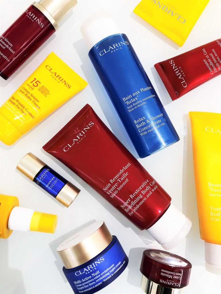 Clarins does Mondrian: This flat lay was great fun to shoot (and my skin looked fab afterwards too)!
![]()
We’re pushing pastels aside in favour of stronger shades. Pillar box red and true-blues with yellow – essentially bringing the block colours of a Mondrian to life.
This isn’t a look that I will be championing personally – I still love a lot of neutral with a gentle colour injection – but we will be seeing braver colour combinations in 2018. Primary colours are at the centre of all hues. They are raw, unashamed and bold. They were fresh in the 1930s and maintain their youthful spirit in a contemporary environment too. Think paint-box colours in their purest form, playfully combined. The ultimate colour-blocking. Ground schemes with black or white accents for true de Stijl style.
COLOUR TREND #8. MOODY HUES
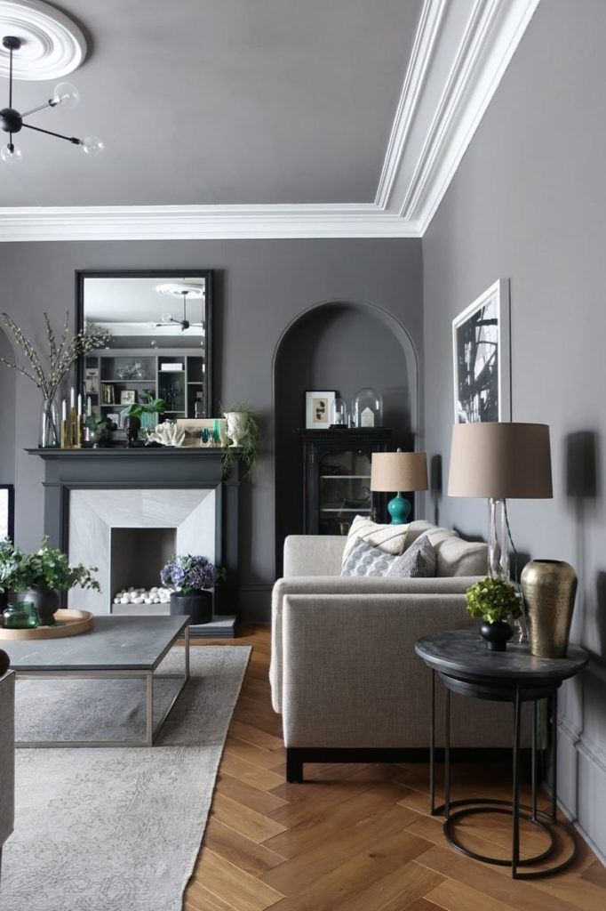 The ultimate gorgeous living room in deep shades of grey. Image source: Design Sixty Nine
On the other end of the spectrum, expect to see dark, moody hues gaining momentum. Dark interiors have gained popularity in recent years with the likes of Abigail Ahern celebrating the dark side. Personally, I like a light and airy wall – something to keep the space fresh – but I can certainly see the appeal of deep inky blue or black walls to create drama.
Black is more popular than ever – in all its guises – with blue/purple undertones or a chalky finish. Also expect to see a lot of dark mirror/glass or blackened bronze finishes – always gorgeous with gold. Along these lines, near-black greens, purples and charcoal will continue to have a moment – whether as deep accents to ground a design scheme or within an entirely moody composition for added atmosphere.
COLOUR TREND #9. AU NATURAL
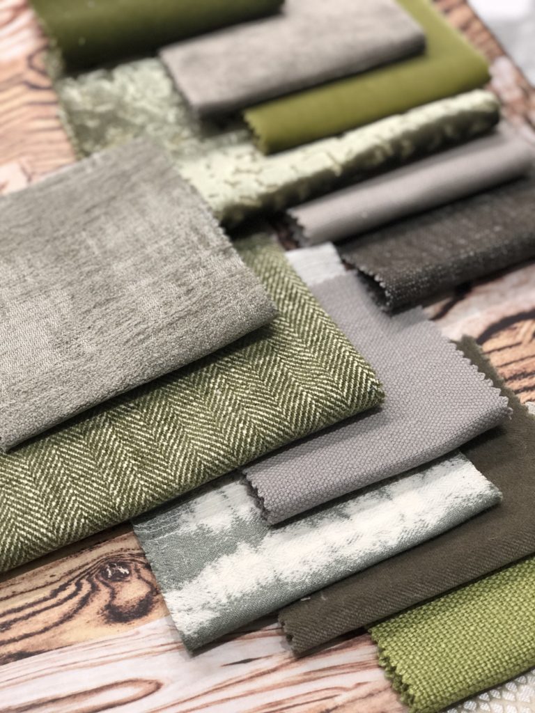 Au Natural: Fabric swatches
Nature is often a huge influence in my designs – from the organic shapes to natural textures and tones. Expect natural-inspired colours to gain popularity in 2018 – I see this as an extension of our greenery obsession last year. Colours that are by no means artificial or brash. Rather; understated, natural shades ranging from sandy hues and fern greens to hessian or stone.
We are turning toward more organic finishes – rough-hewn wood and textural shagreen alongside imperfect shapes. These natural-inspired shades are the colour equivalents. This is a trend that I’m really excited to embrace with open arms.
COLOUR TREND #10. TRUE BLUE
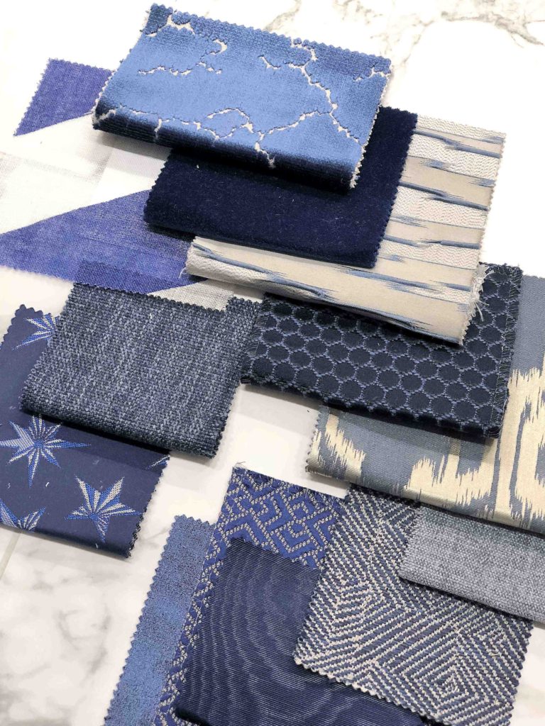 True Blue: Fabric swatches
Let’s face it, no matter what new trends are thrown at us, it always comes back to blue and white. This pairing is pure genius – whether playfully interwoven on a Moroccan tile or casually combined on a breton tee – in truth, we just can’t get enough. I talked about the power of blue and white in my ‘Dreaming of White Decor’ post which you can read here and I’m still as enthused as ever. It’s timeless; the perfect combo.
This year, we will be celebrating deep midnight, navy, prussian and oxford blues alongside denim hues. These look gorgeous with greys and greige, as well as whites and natural timbers. Also expect to see softer powder blues and seafoam which can really ‘pretty up’ a space.
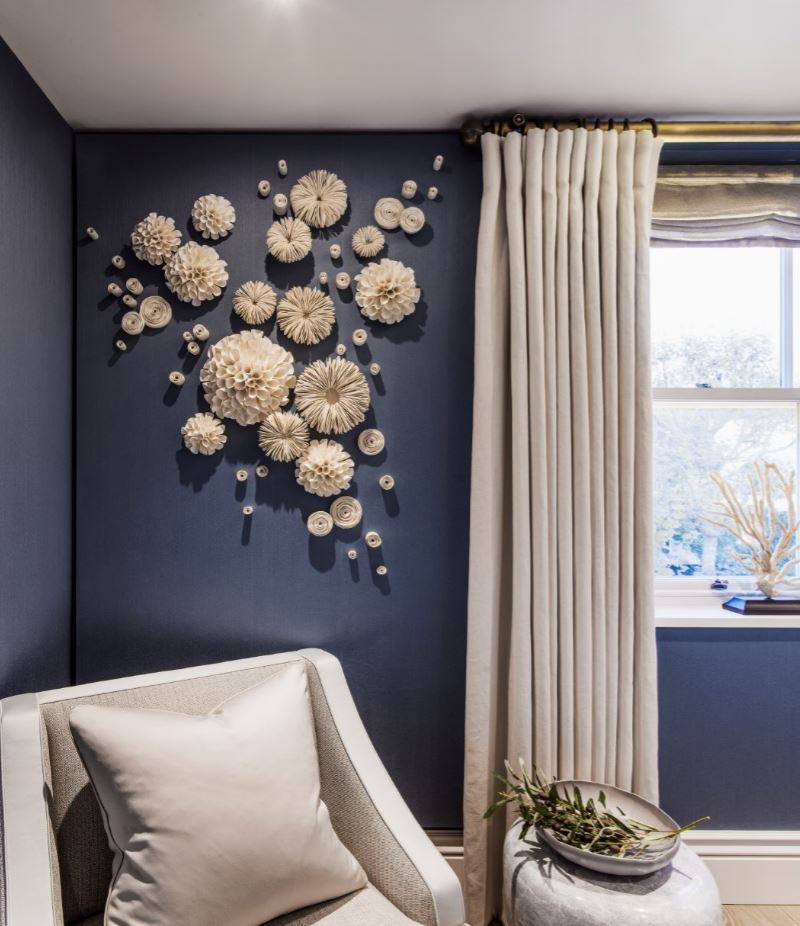 A snapshot of the gorgeous, Grecian-inspired bedroom at Holiday House, London. Designed by Laura Hammett Interiors
COLOUR TREND #11. CAMEL
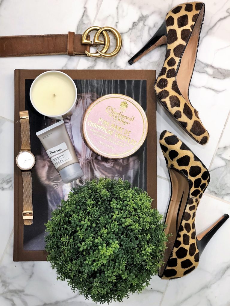 I love a bit of animal styling
Hands up if you own a camel coat?! I’ve certainly invested (albeit in the knitwear and bags too) and I am absolutely enamored by the versatility of this shade. It’s undeniable; camel is the fashionista’s colour of choice right now. And where fashion leads, interiors tend to follow. An offshoot of our ’70s craze but too important not to have its own named category, camel is big business. Flattering, expensive and beautiful with its trusted side-kicks of cream, navy and black and moving to red and soft, blush pinks and green.
Camel is also gorgeous when paired with metallics, which have all but moved into neutrals territory. I feel that this is a colour that will continue to gain momentum as the year unfolds.
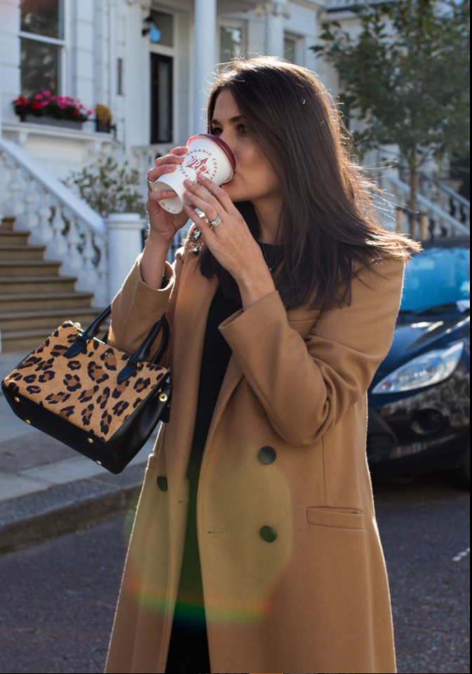 Rocking the camel (and the latte)…
COLOUR TRENDS – YOUR SAY
I hope you’ve enjoyed my personal interpretation and guide to 2018 colour trends.
**Please note that I am not an official trend forecaster by any means (yes, this is an actual job). I do, however, attend regular industry exhibitions and trade shows, new collection unveilings, trend talks, blogger/interior design events and I am privy to lots of insider information. (Ooh, I sound like a spy)! This is my take on all I have read, seen and heard, with a little bit of wish-listing on the side. I am excited to see how the year unfolds and how many boxes are ticked.**
I would also love to hear your ideas and feedback on my trend suggestions in the comments below.
Brown…who’s with me?!
Girl signing off,
Sarah x
 @2017 - Girl About House. All Rights Reserved.
11 thoughts on “11 COLOUR TREND PREDICTIONS FOR 2018”
I’m still a big griege and gold fan, and although I do normally gravitate to “millenial pink”, and I am loving the warmer, more rusty tones of pink and orange that are about at the moment.
I’m loving the natural greens around at the moment in all the spring interiors. Stunning.
Wonderful article, love the colors and especially the flower design on the wall. Thanks for posting.