
A COMPREHENSIVE GUIDE TO THE BEST NEUTRAL PAINT COLOURS
Finding the ultimate neutral paint colour – it’s arguably the holy grail of interior design. Clients and friends describe this as needle-in-a-haystack territory; there are just so many options to choose from. And, let’s be honest, a flimsy little colour-card can only take you so far!
I’ve already written a post on how to choose the perfect paint colour for your walls – read it here – but sometimes, ‘tell-me-the-actual-name’ recommendations are all you really need. Tried and tested hues which offer immediate success.
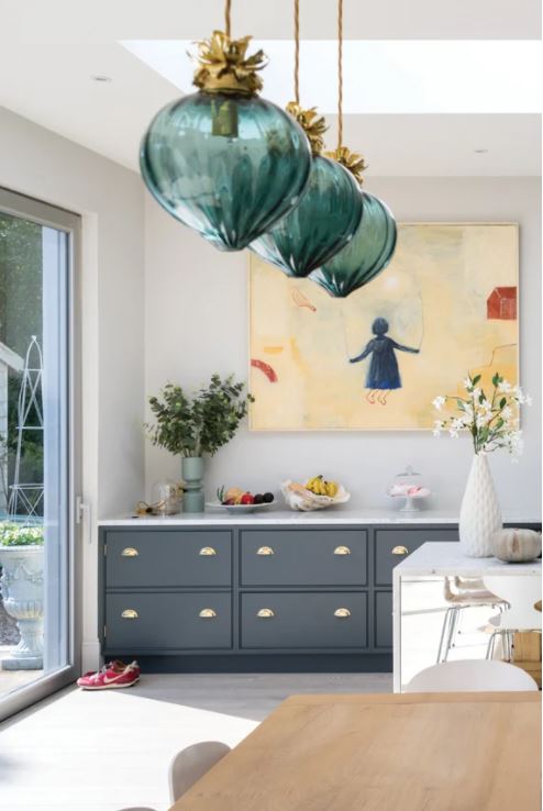
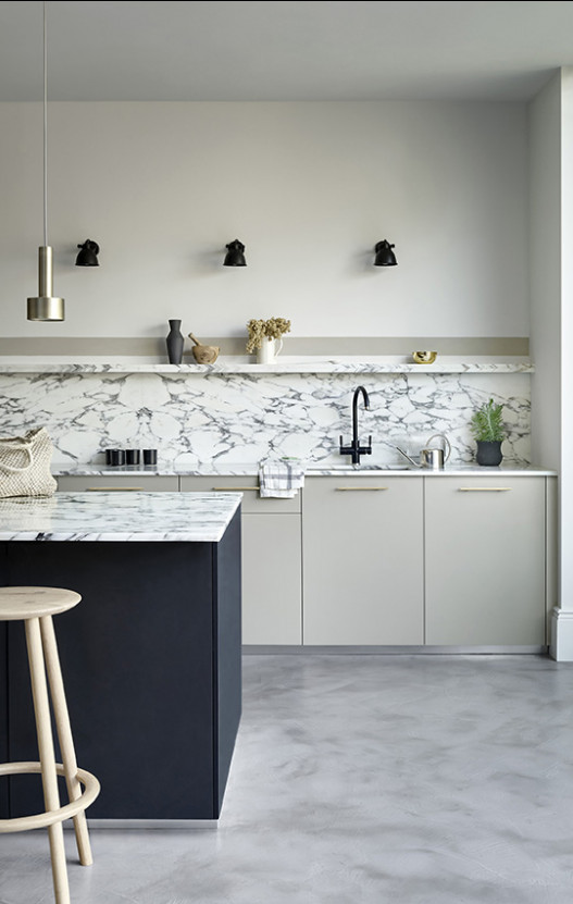 Kitchen goals showcasing the ultimate in neutral paint colours and offset with some punchy, darker accents. Walls in Paint and Paper Library’s Minim and fitted cabinetry in Opus
Neutral paint colours appear easy pickings at first. Either you want to go more beige or more grey, off white or cream. Saturated with options, the market offers beautiful shades across a range of price points too. All good, right? The reality is that with labels inaccurate, descriptions unreliable and the choice overwhelming, unless you spend a small fortune on sample pots and paint out large parts of wall, you’re playing Russian Roulette.
So here’s my neutral paint colour round up. Because this December, aside from working our way through a tub of Celebrations, what more is there to do than sit and research home projects for the year ahead? 2021 is certainly set to be a Renaissance of sorts. Let’s hope, anyway.
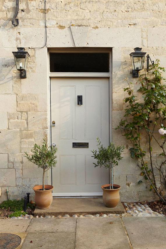
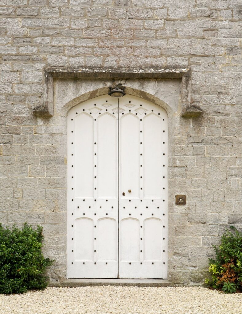 First impressions count! This impressive door sings in Farrow and Ball‘s Wimbourne White
NEUTRAL PAINT COLOUR #1: THE ULTIMATE GREIGE
 Dancing the delicate parameters of grey and beige, greige is one of my favourite shades. It maintains the casual cool of grey whilst the beige element offers warmth and charm. There are some fabulous greige shades available and they work beautifully with a host of metal finishes and natural timbers (yummy)!
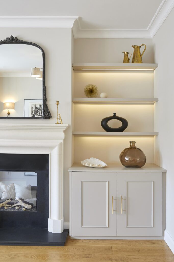 Farrow and Ball’s Skimming Stone is a beautiful greige shade. Interior design and styling by Sarah Mailer Design
Some of my ultimate greige paints are;
- Skimming Stone by Farrow and Ball
- Pearl Barley by Graphenstone
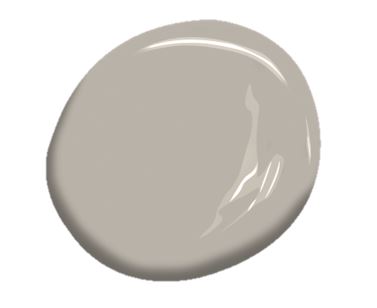
- Silver Fox by Benjamin Moore (as shown on the swatch above)
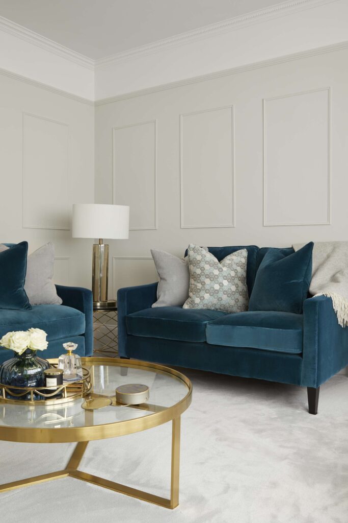
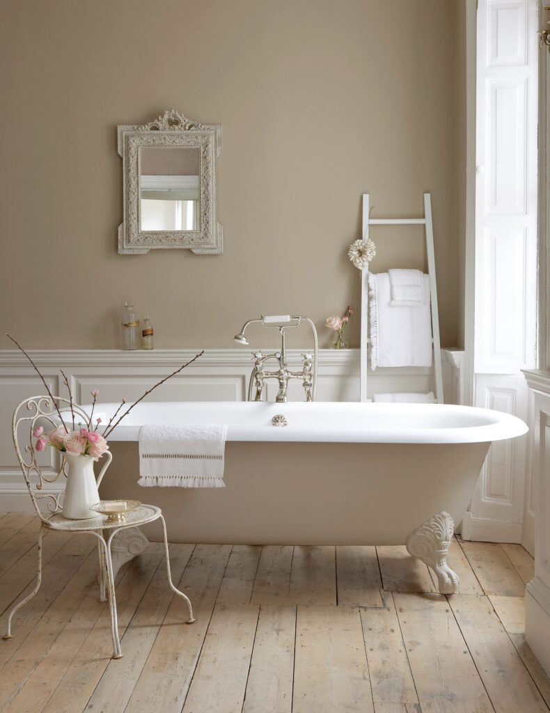
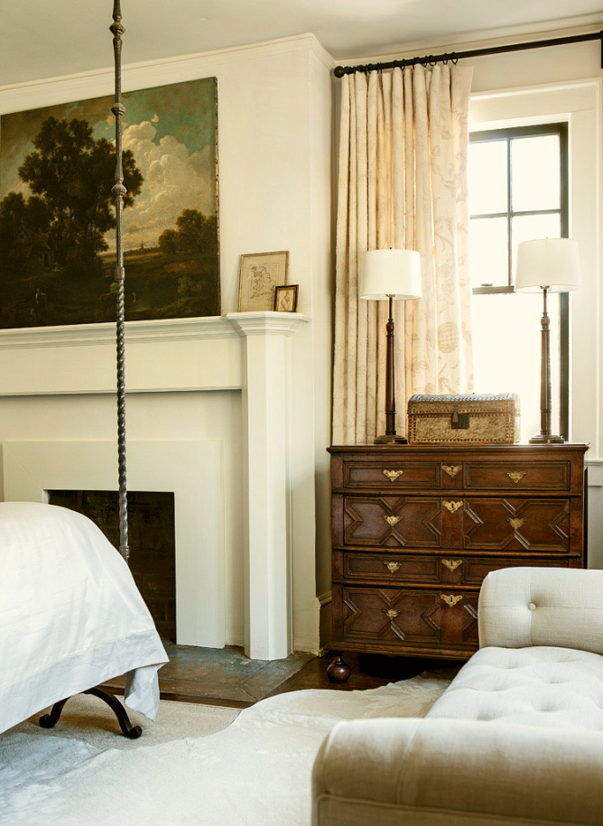
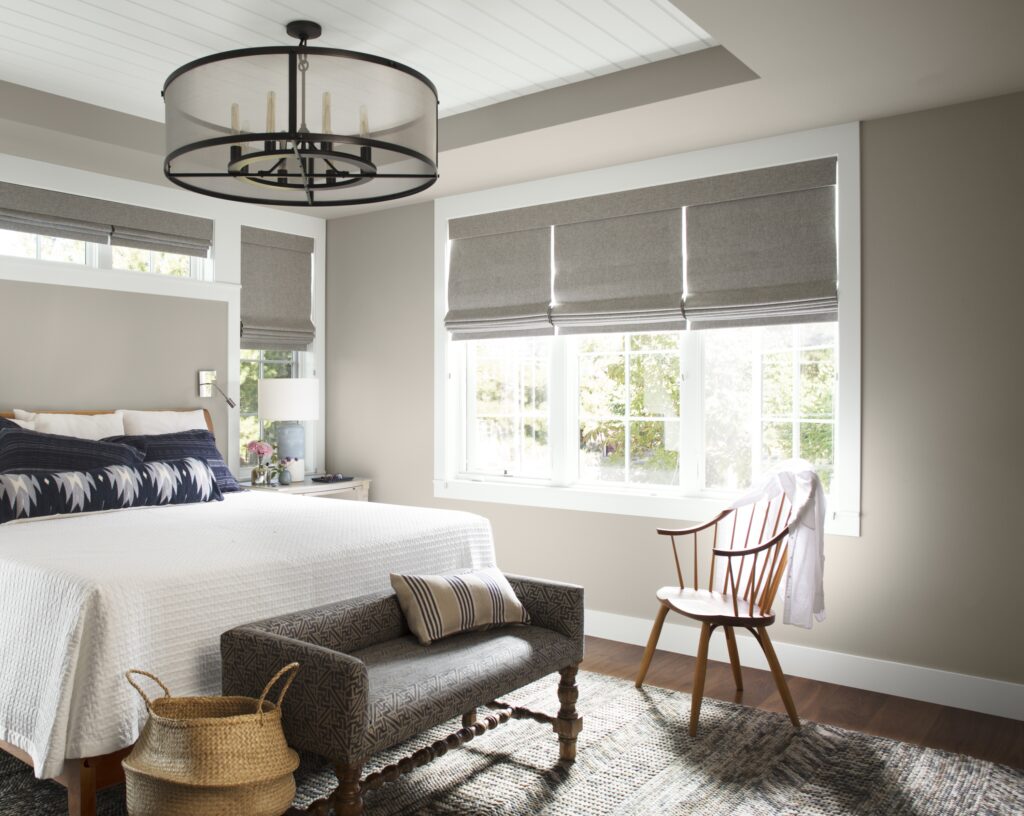 Greige is a calming hue – perfect for the bedroom. Here, the walls are painted in Silver Fox by Benjamin Moore
NEUTRAL PAINT COLOUR #2: PALE AND INTERESTING
Pale doesn’t mean have to mean dull as the movement of dark, dramatic walls may have led us to believe. From soft nudes and lavenders to green-greys, just the subtlest hint of colour can go a long way and still feel pretty neutral.
- Slaked Lime by Little Greene
- Willow I by Paint and Paper Library
- Shaded White by Farrow and Ball
- Foggy Morning by Benjamin Moore (as shown on the swatch above)
 A hint of colour can still feel pretty neutral and understated. Image Little Greene
NEUTRAL PAINT COLOUR #3: THE WARM GREY
Grey, yes, but not cold. Far from it. And eternally chic!
- Pashmina AF-100 by Benjamin Moore (as shown on the swatch above)
- Cornforth White by Farrow and Ball
- Slate III (and Slate IV) by Paint and Paper Library
- Ammonite by Farrow and Ball
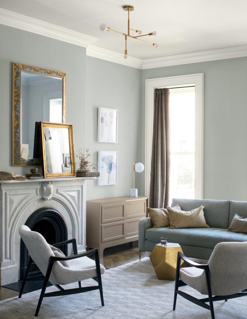
 Ammonite works beautifully here will deep teal, seafoam and brass. Interior design by Sarah Mailer Design
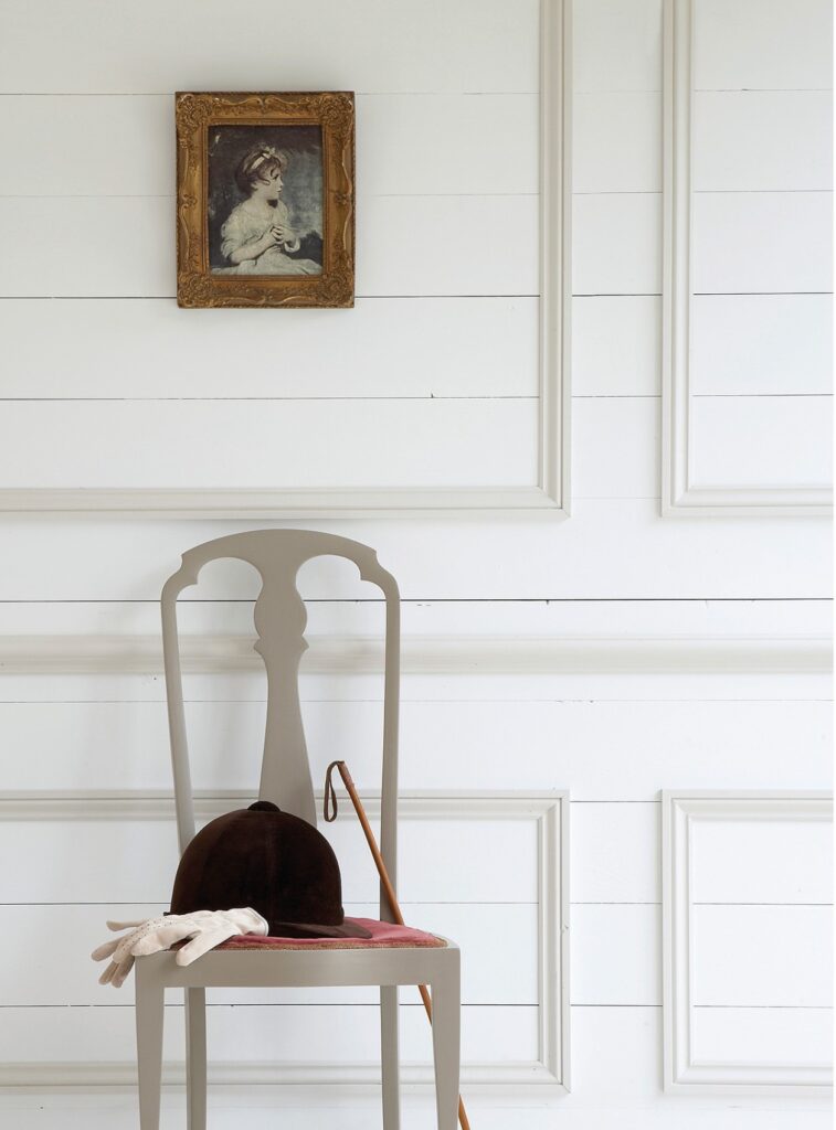
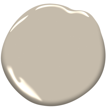
NEUTRAL PAINT COLOUR #4: TANTALISINGLY TAUPE
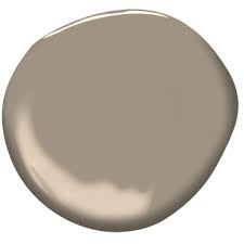
Taupe is such an exquisite shade. With a nod to both grey and brown, it has long been design legend Kelly Hoppen’s signature hue. From the subtlest touch to deeper taupe, here are some of my favourites;
- Weimaraner AF 155 Benjamin Moore (as shown on the swatch above)
- Charleston Grey by Farrow and Ball
- Truffle by Paint and Paper Library
- Joanna by Little Greene
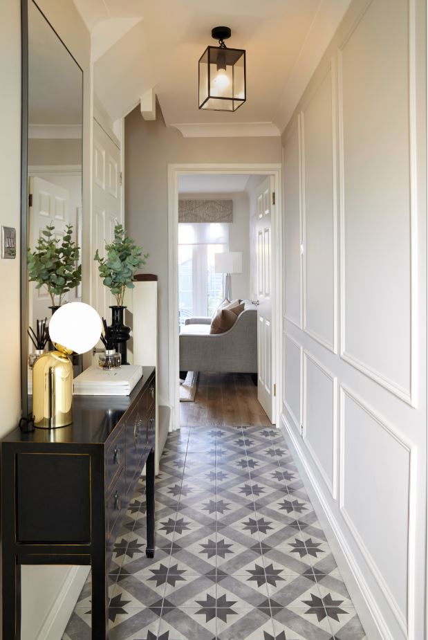 Little Greene’s Joanna is the palest of taupes and perfect for this narrow hallway by Sarah Mailer Design
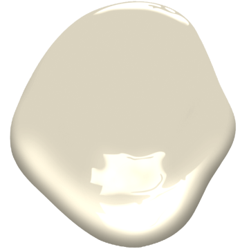
NEUTRAL PAINT COLOUR #5: THE OFF WHITE OF DREAMS
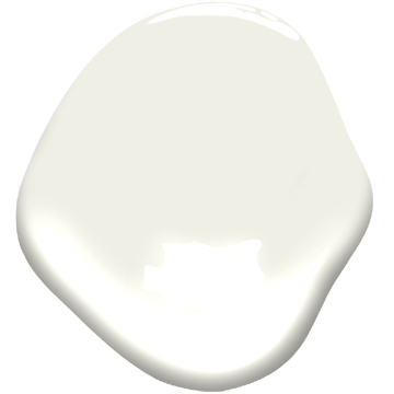
When you want to go white white, but not brilliant white. Here are some porcelain beauties;
- Snowy Owl by Sanderson
- Porcelaine by Graphenstone
- Fuji by Paint and Paper Library
- Shirting by Little Greene
 Shirting by Little Greene is a bright but soft white and is also great for more understated white woodwork and ceilings
NEUTRAL PAINT COLOUR #6: STONEY GROUND
Think of beautiful limestone fireplaces and the impressive curve of the grand terracing on London’s Regent’s Crescent. A stoney neutral always gets my vote and is the perfect backdrop for a whole host of interior schemes. You really can’t go far wrong. Here are my favourites;
- Portland Stone by Little Greene – I love the entire Portland Stone range from pale to dark!
- Stoney Ground by Farrow and Ball
- Tom’s Bakery by Earthborn
- Stone Hearth 984 by Benjamin Moore (as shown on the swatch above)
 Stoney Ground by Farrow and Ball – It does what it says on the tin!
NEUTRAL PAINT COLOUR #7: BEAUTIFULLY BEIGE
It’s fair to say that beige was having a difficult time until its recent resurgence. Shaking off the past (magnolia, what?), it’s now the shade du jour. And I’m absolutely delighted! After all, beige is warm, friendly and enveloping. My prediction is that it will quickly regain its crown as King of the Neutrals! Some of my favourites are;
- Clay by Edward Bulmer
- Beige 02 by Lick
- Jute AF-80 by Benjamin Moore
- Clay IV by Paint and Paper Library
 Keeping it tonal with a range of beige at Little Greene
NEUTRAL PAINT COLOUR #8: TRUE GREY
 Metropolitan is a reliably true-grey with cool undertones by Benjamin Moore
Grey has long transcended fad-status, heavily cementing itself as a colour classic! All grey is an ever-popular look both on the catwalk and in our homes. Cue these beauties who don’t stray too far from warm or cool. They’re just right;
- Metropolitan AF-690 by Benjamin Moore
- Blackened by Farrow and Ball
- Porpoise by Graphenstone
 Blackened by Farrow and Ball is the perfect true grey in most spaces
NEUTRAL PAINT COLOUR #9: CREAMY & DREAMY
Whilst cream isn’t necessarily perceived as particularly contemporary, these shades carry traditional charm whilst feeling somewhat fresh.
- Slipper Satin by Farrow and Ball
- White Lead by Edward Bulmer
- Cotton Balls OC-122 by Benjamin Moore
 Cotton Balls OC-122 by Benjamin Moore is a sophisticated and creamy off-white
NEURAL PAINT GOALS!
Hopefully this piece has given you some inspiration and confirmed that neutral need not be bland. If anything, I love the possibility that a neutral backdrop brings to a space – the support act to some statement furniture and artwork. Whether you opt for all white (see another post I wrote on this here) or deeper, darker hues, enjoy the power of a fresh coat of paint!
Have a wonderful break and please do share your decor ideas in the comments below or over on my instagram.
Girl signing off,
Sarah x
** If you’re looking for more interior ideas or inspiration, the following posts my be useful: 5 Ways to Achieve a Luxury Boutique Hotel Style Bedroom | Coffee Table Book Styling | How to Design Children’s Bedrooms | How to Create a Spa Bathroom
 @2017 - Girl About House. All Rights Reserved.
8 thoughts on “A COMPREHENSIVE GUIDE TO THE BEST NEUTRAL PAINT COLOURS”
Great Post ! Have just painted my living room in Skimming stone – having a built in TV cabinet / unit beside fireplace. What colour do you think would be a good contrast against it?
Black accents and grey sofas…
I love this post. My husband is always teasing me for wanting to keep our walls neutral, but I always argue that there are a multitude of whites, let alone greiges, greys, taupes, grues etc.
By keeping the walls pale and neutral, you can pack a punch with accessories and furniture. Thanks for this lovely guide to shades.
My mom used loved neutral colors in our home ever since, and I do not complain about it. On the contrary, neutral colors are an excellent choice because they add a relaxing ambiance. Great post!
Good blog. I read your article after. Now that I’m creating, I have more ideas. I greatly appreciate it. The greatest method to exchange ideas of Garden Studio with such a fantastic website is Qube Buildings.