

MAPLETON CRESCENT – SUPPER CLUB, GREENERY & GREAT DESIGN
MAPLETON CRESCENT SW18 SUPPER CLUB
It’s no secret – I love a blogger event. The chance to mingle with like-minded people always appeals. It really offsets the self-inflicted solitary confinement that comes with blog-post writing. So, when innovative urban property developers Pocket Living invited me to a ‘Supper Club’ and to write about their latest project, I was totally on-board. In celebration of ‘Mapleton Crescent SW18’, the creative soiree was curated to showcase the motivations and processes behind the design of this exciting build.
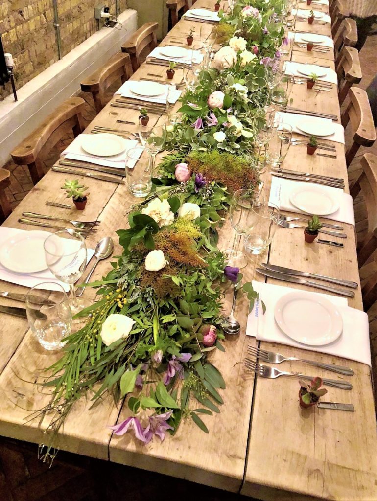 Gorgeous table-styling at the Mapleton Crescent SW18 Supper Club event at Flotsam and Jetsam, Wandsworth
MAPLETON CRESCENT: WHY THIS PROJECT?
My own property experience began in a standard new-build flat. Whilst it was a financial stretch and architecturally drab, I absolutely loved it. It was mine! It also was decidedly ‘vanilla’ – both inside and out. In fact, red wine was banned as a potentially hazardous substance given the cream loop-pile carpet.
It was to be expected from a new-build though, right? Small spaces, underwhelming architecture and a long snagging list.
Not with Mapleton Crescent…
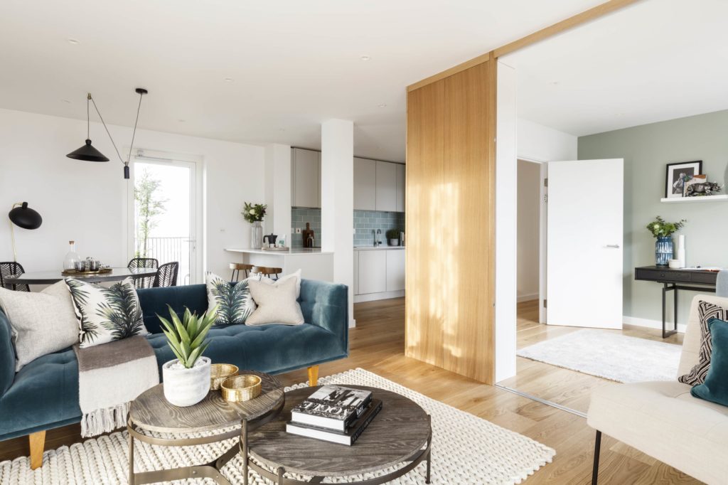 The airy, bright open-plan living/dining space in the Mapleton Crescent show flat is far from ‘vanilla’. The internal palette feels fresh and nods to the external green-blue glazed tiles
Gorgeous show-house styling aside, it’s the ethos behind the Mapleton Crescent project that really appeals to me.
Pocket Living create accessible new-builds for city-dwellers and this project in particular places huge emphasis on design innovation. In fact, the signature feature of this build are the external green ceramic tiles which undulate across the surface – an artistic nod to both nature and traditional craft techniques. And, whilst I am an unashamed fan of luxury brands and style, I do very much endorse the notion that affordability shouldn’t compromise design. This site-sensitive build, which is structured around a triangular core, offers residents economical yet design-centric accommodation.
 Style (alongside functionality) is central to Mapleton Crescent’s success
SUPPER CLUB: THE EVENT
Boasting a string of guest speakers, each individual talk contributed to the evening’s wider theme of collaboration. The Antipodean-flavoured Flotsam and Jetsam restaurant had been beautifully styled, with fresh foliage atop the driftwood table and mini-succulent treats for all guests. Greenery was – it transpired – the order of the evening.
With Mapleton Crescent SW18’s bespoke green glazed tiles the focus, this Supper Club would also explore how colour influences all aspects of design.
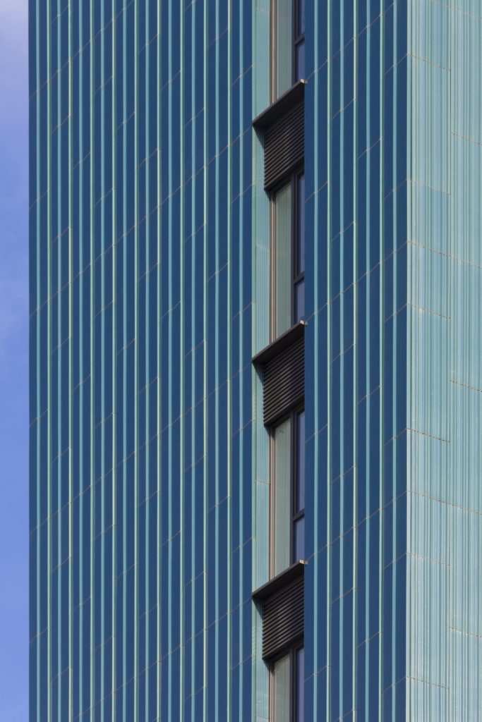
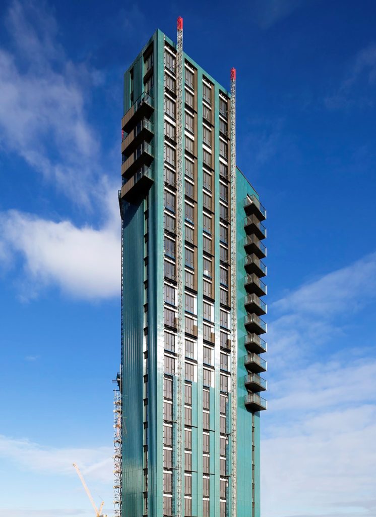 A (nearly) full shot of the impressive building. The interplay of green tile and blue sky is so beautiful
GREENERY: ACHIEVING THAT URBAN OASIS
Whilst Spread London ensured that we were suitably fed and watered, Pantone’s Abigail Bruce discussed the importance of colour. How it can set the tone of a space, alter mood and create atmosphere. Whilst soft, calming hues may denote rest-bite from the hubbub of modern life, brights can energize! (For more on this, read my post here). She also placed huge emphasis on the ‘need for green’.
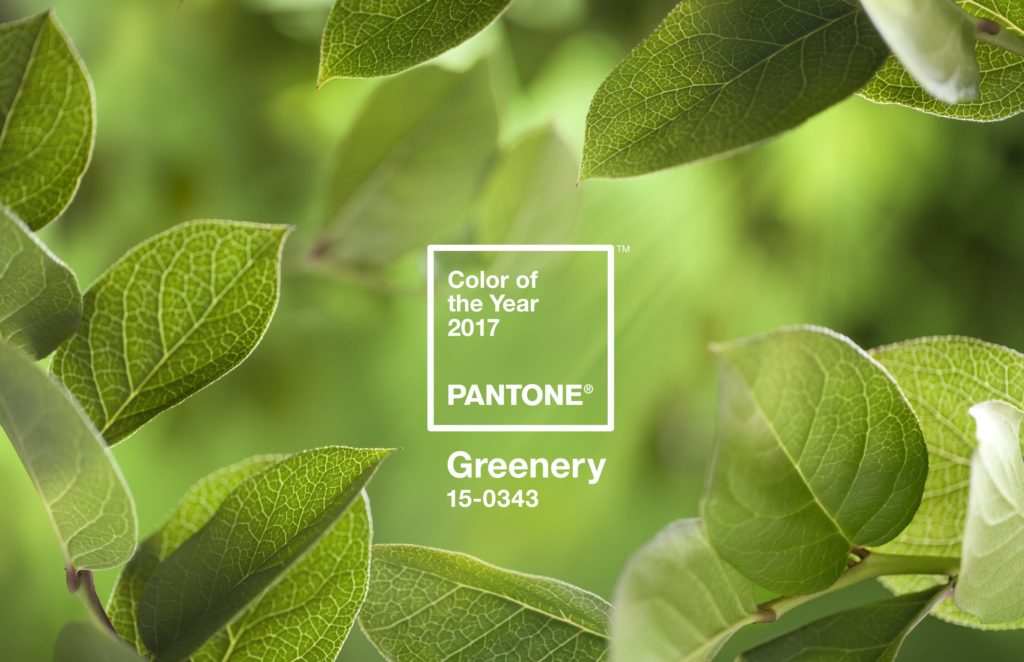
Greenery – our obsession lives on
‘Greenery’ – a fresh, Kermit-the-frog shade – was Pantone’s Colour of the Year in 2017 but is proving far from a transient fad. With its overt references to the natural world, it really is the perfect hue for an urban structure; you’ve gotta love a bit of poetic contrast. After all, as Pocket Living’s Lucian Smithers so aptly observed, Mapleton Crescent’s likely dwellers – sociable, urban millennials – are increasingly favouring experience over material possession. Therefore, a nod to nature felt entirely befitting to the design.
 Denoting calm and sanctuary from the hustle and bustle of our modern, technology-driven lives, it certainly was an appropriate choice for a tall, triangular build in the heart of SW18
For me, the building’s colour is the defining feature. The lustrous green-blue surface sings against a crisp blue sky (or even on a decidedly grey day). Mapleton Crescent would look and feel vastly different had it been clad in aluminium or rendered.
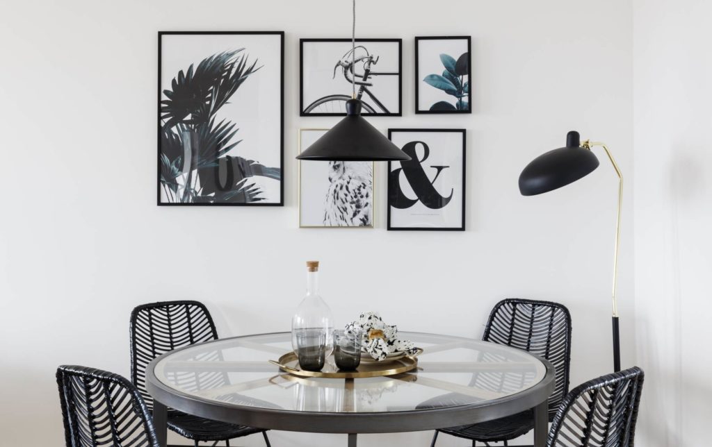
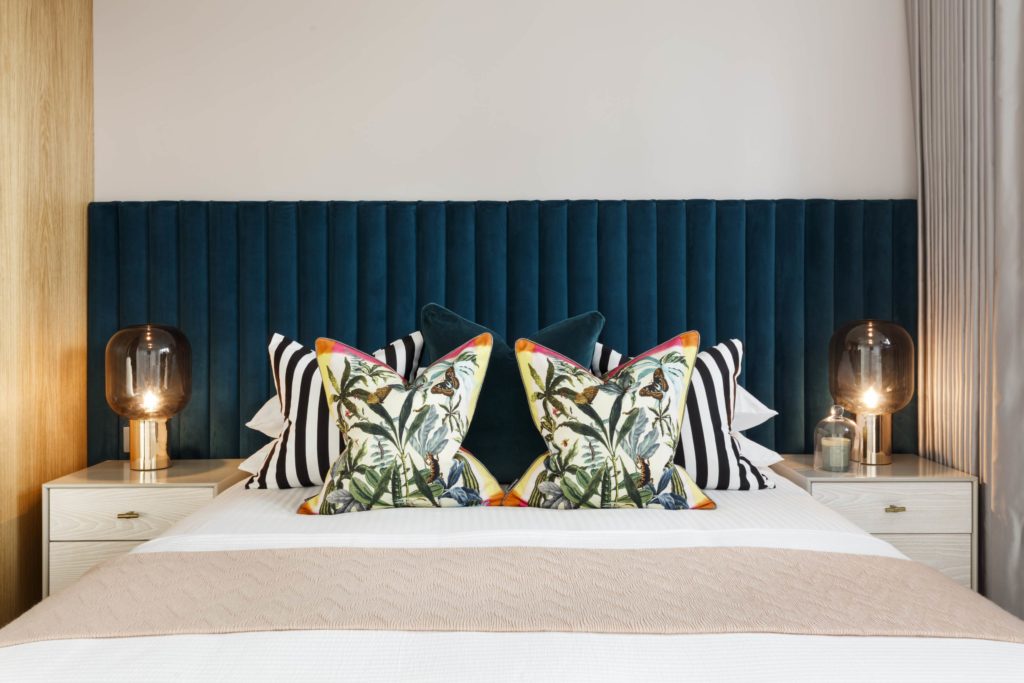 The interior and exterior spaces are also engaged in an ongoing dialogue. Here, the botanical cushions perfectly offset the teal velvet and monochrome stripes
THE POWER OF CRAFT
In the UK, we’re all about brick. Our go-to building material of choice, brick is widely available and easily accessible. During the evening, Neil Deely talked about how his architectural practice, Metropolitan Workshop, insisted upon a departure from the mundane. Instead, they had always planned to clad Mapleton Crescent in something different – more unexpected. The use of ceramic tiles was also intended to make reference to more traditional building finishes. Ceramic tiles are, after all, showcased at many original London underground stations.
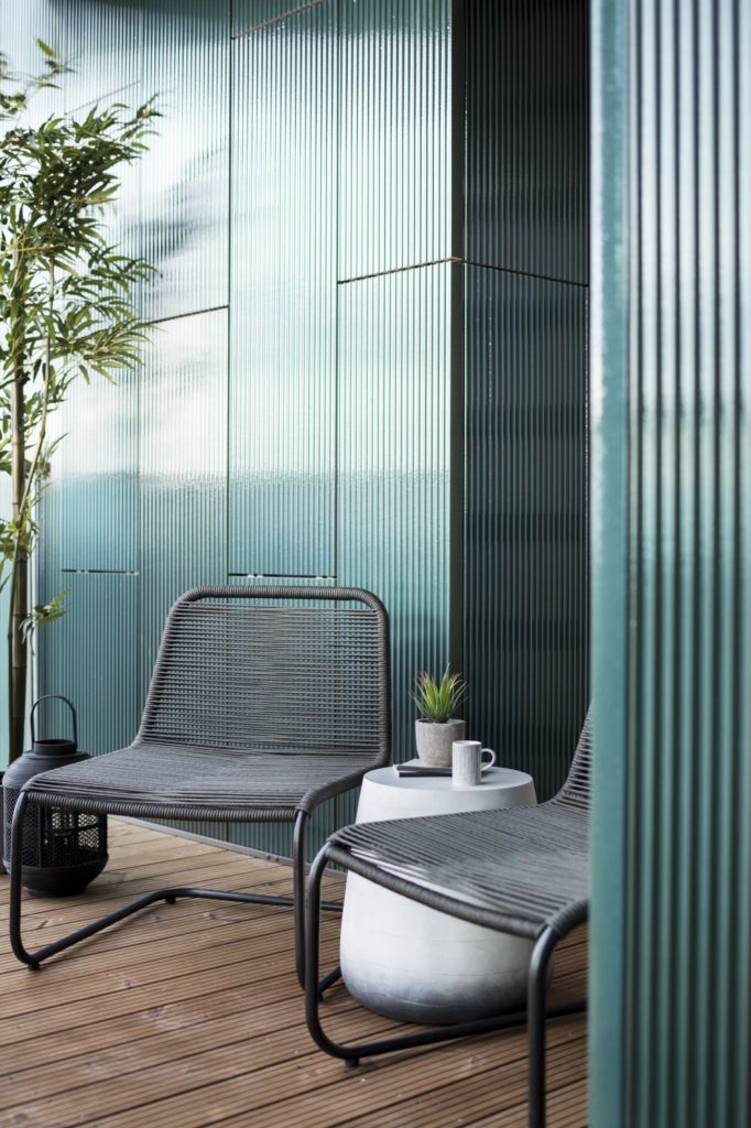 This stylish terrace offers a welcome outdoor retreat where the ceramic facade of the building can be enjoyed close-up.
Ceramicist Loraine Rutt had been commissioned to develop the perfect tile for the project. She discussed how she had spent a significant amount of time prototyping and perfecting both the shape and shade of the statement tiles. Loraine’s creative journey had a distinctly ‘Arts and Crafts’ flavour in its celebration of the artisan process.
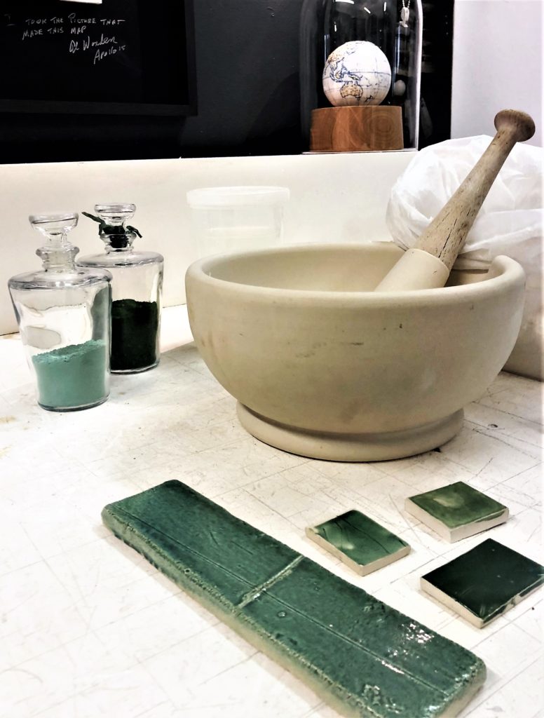 Loraine Rutt discussed the detailed and painstaking process of glaze-development to achieve the desired green-blue shade
A rebellion against ‘soulless’, mass-produced goods, the late nineteenth century Arts and Crafts movement instead celebrated the hand-made. It championed decorative processes and attention to detail. Alongside greenery, it is another trend that is gathering momentum in 2018. Consider the popularity of personalised products – slippers or a phone-cover emblazoned with your initials or a name-plate necklace. The renewed support for traditionally crafted items – from chunky knitwear to hand-made ceramics.
The story behind a product is also becoming increasingly important and I really enjoyed uncovering the motivations behind Mapleton Crescent’s design.
DESIGN DIALOGUE
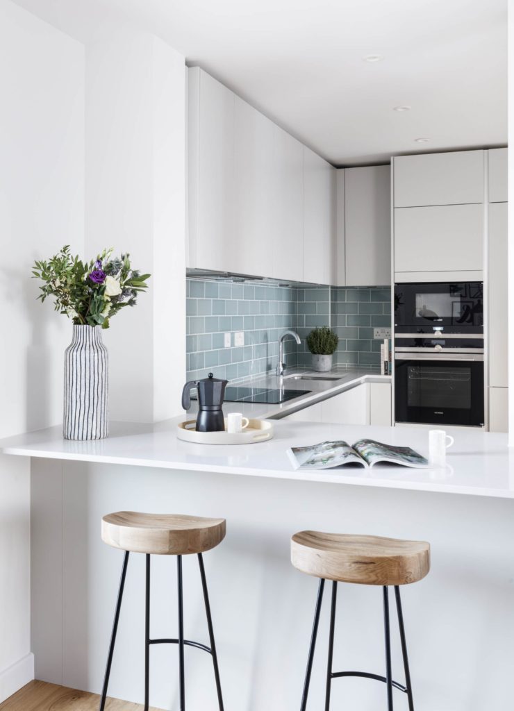 More tiles form the kitchen backsplash. We’re at the start of a major tile revival!
Mapleton Crescent SW18 is my kind of project. It celebrates the deeply connected relationship between art, craft and architecture whilst making great design openly accessible. After all, why should new-builds be anything but innovative and exciting? – Goodbye ‘vanilla’!
Girl signing off,
Sarah x
*Please note that this post has been sponsored by Pocket Living. As always, the content is entirely original and all views expressed are my own.*
The Pocket Living mission is to help city makers make London their home. Their Pocket homes provide compact one bedroom affordable homes for young Londoners local to the development, whilst their larger two and three bedroom Pocket Edition homes are available to all.
A limited number of Pocket Edition homes are still available at Mapleton Crescent SW18! To find out more visit mapletoncrescentsw18.com or call 020 7291 3683 to arrange a visit to their newly launched show home.
 @2017 - Girl About House. All Rights Reserved.