
HOW TO TAKE INTERIOR INSPIRATION FROM THE NED HOTEL (PART 2)
A NOD TO NED – INTERIOR INSPIRATION FROM THE BANKERS’ LAIR
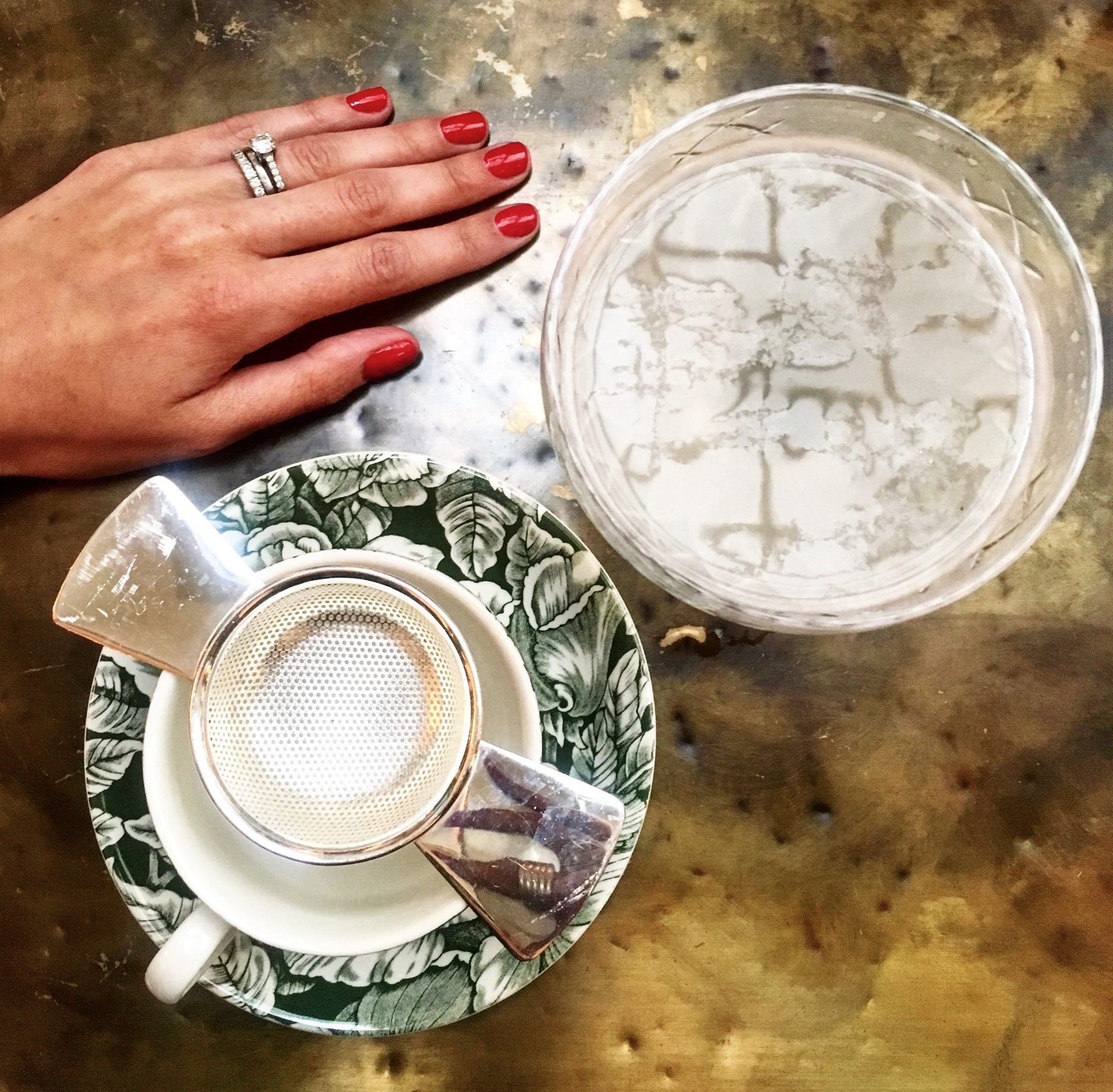
I went back to The Ned this week – all in the name of research, of course. And – also for research purposes – treated myself to their Cheeky express nails and afternoon tea experience. To truly gain interior inspiration and understand what makes a place stylish, it’s imperative to actually ‘do’, to experience – rather than just look. So, I did it ALL on your behalf. You can thank me later!
 Suffering for my art with a mani and an English Breakfast at The Ned
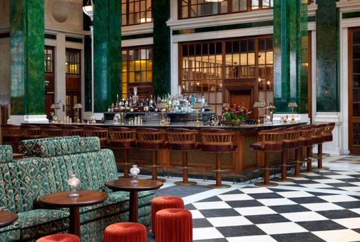
In the last post we talked about the timeless elegance – that heritage flavour – that The Ned exudes. Originally designed by Sir Edwin (‘Ned’) Lutyens (as a bank) in the 1920s and re-launched in 2017 as the newest hot-spot in town, it has a distinctly jazz feel. Dollar green accents, in the architectural features and upholstery, recount its glory days of big deals, hustle, bustle and the smell of fresh bank notes in the air. The inspiration that I took has as much to do with its attitude as its design. It’s seriously cool. And, isn’t it helpful that green is also deliciously en vogue and the perfect accent to a monochrome base?!
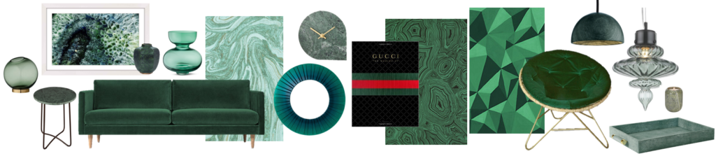
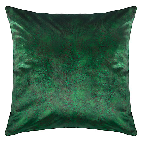
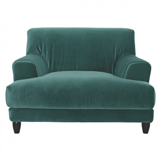
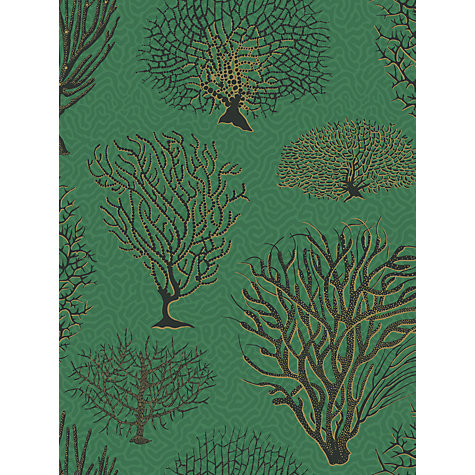
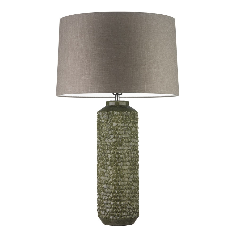
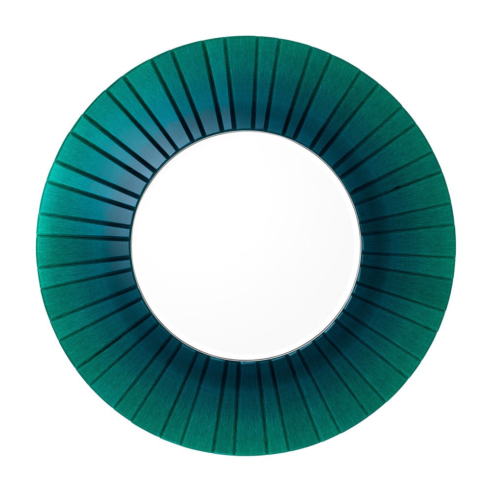
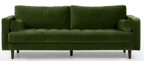
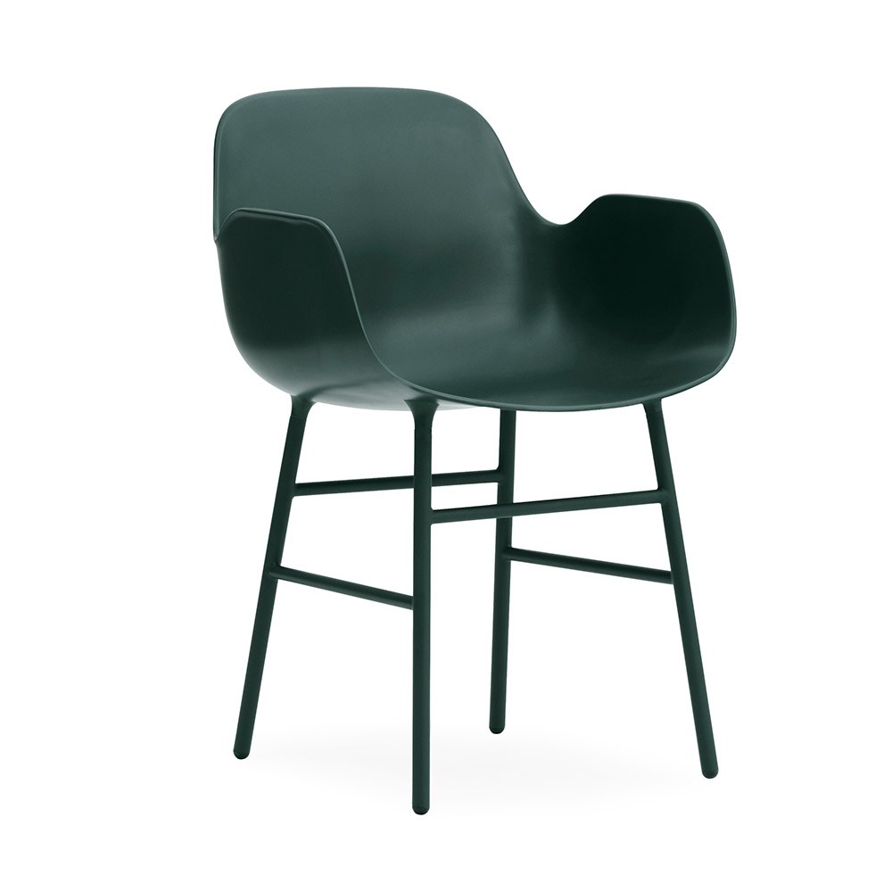
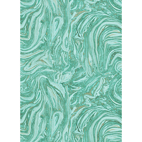
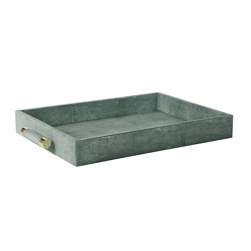
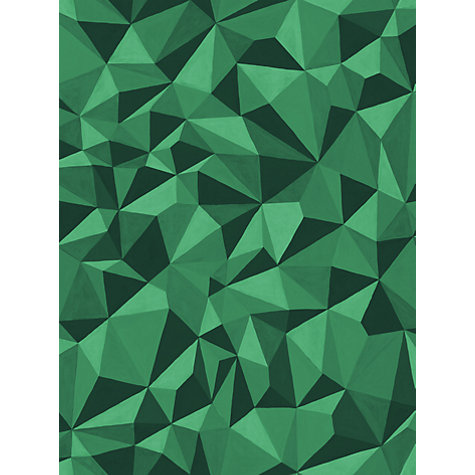
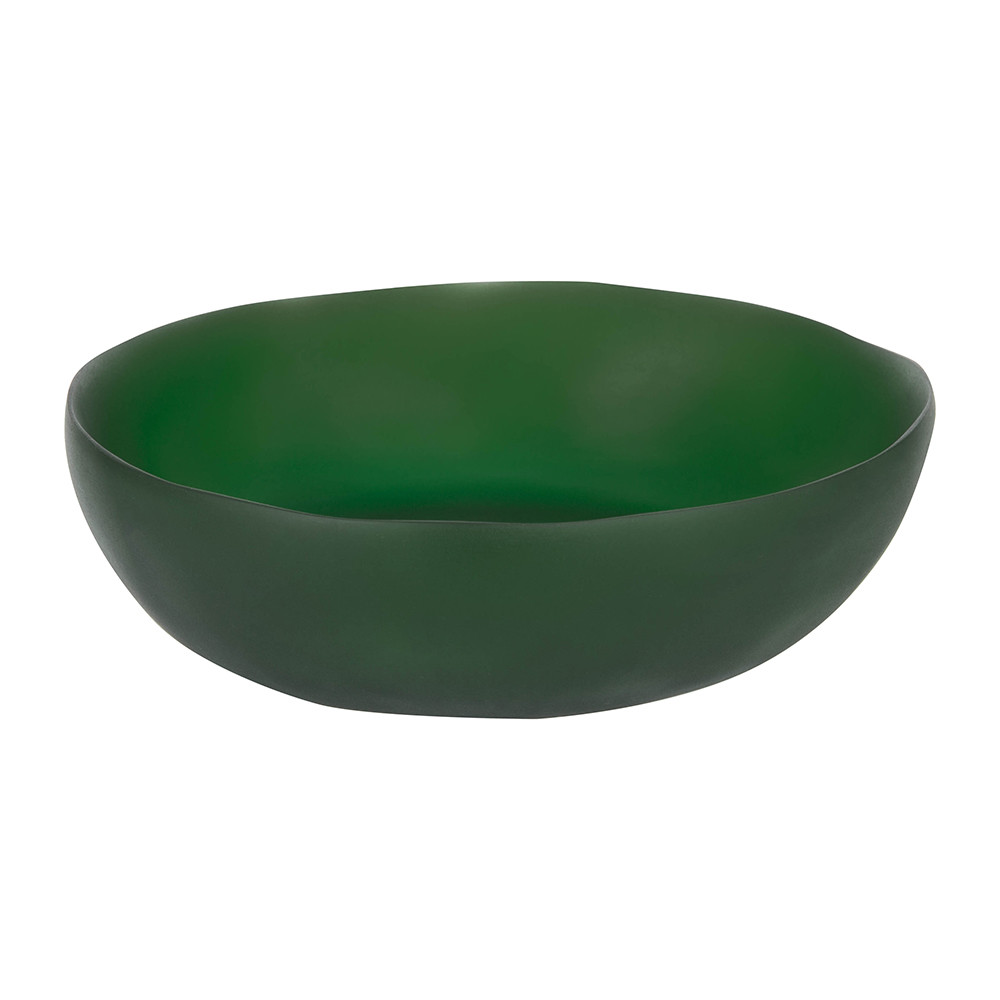
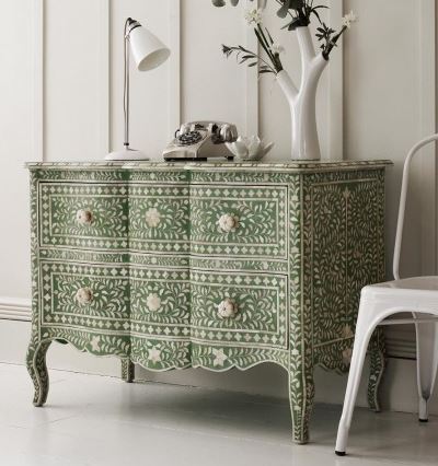
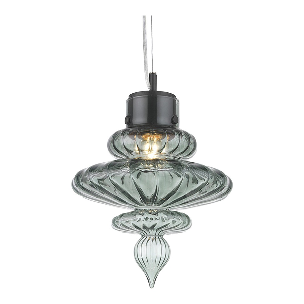
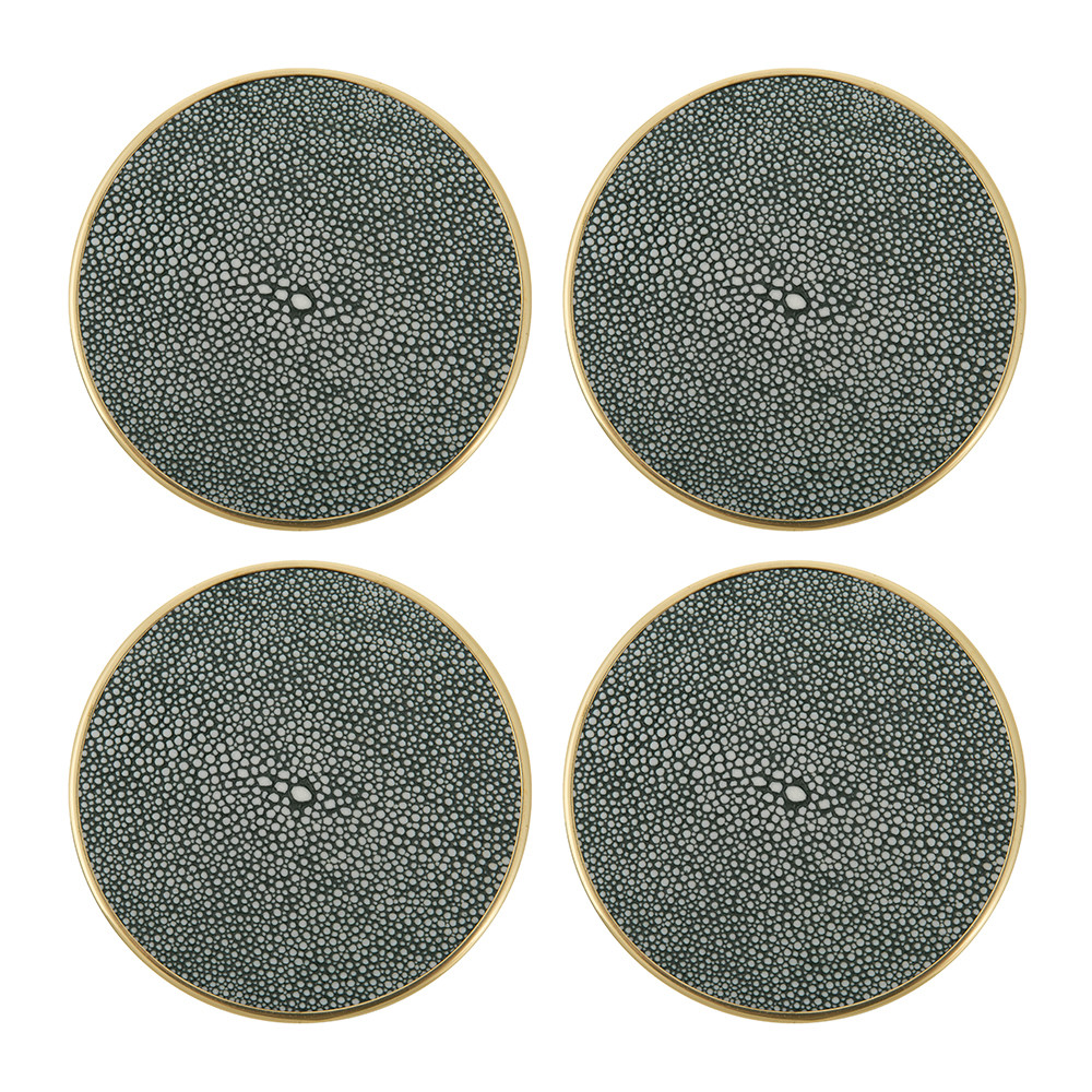
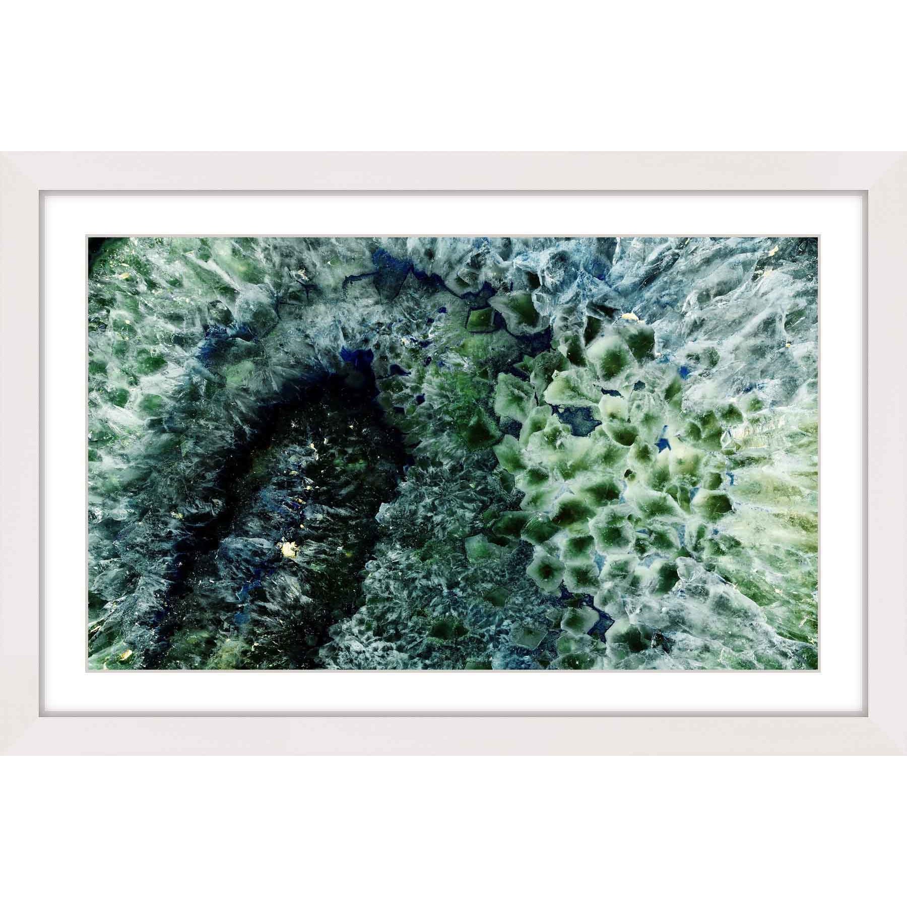
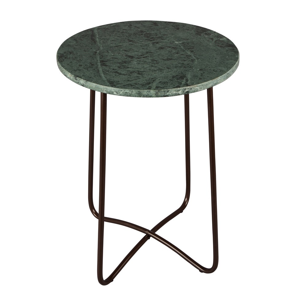
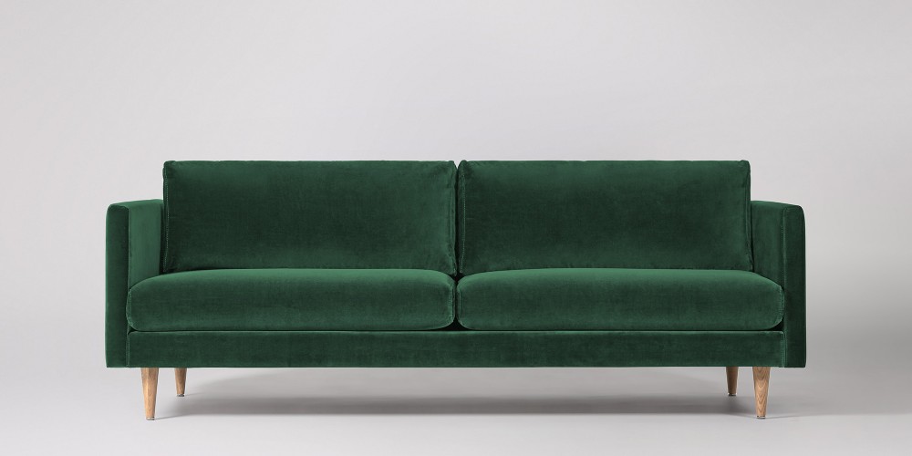
INTERIOR INSPIRATION: GREEN WITH ENVY
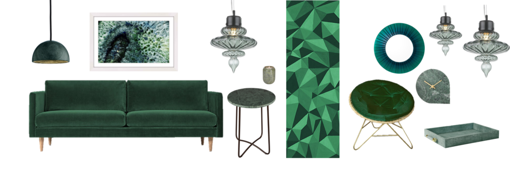 Emerald accents are totally luxurious and serene. They are also massive news right now!
So here’s my emerald green look-book with some must-have pieces to accent your space. I have to admit, I’ve deviated slightly with some variations on emerald too, which is totally Ned-led. The Ned’s interior mixes shades with grace and sophistication, so don’t be afraid to do the same. This adds depth and drama.
GREEN DREAM: SHOP THE LOOK
COMPLIMENTARY COLOURS: A SURE-FIRE WINNER
There’s plenty of interior inspiration to digest at The Ned. Whether you’re a fan of all the individual elements or not, there’s a huge amount to learn from the way all components of the design are cleverly layered and combined. For example, the green hues work so effectively alongside the warm, reddish shades, walnut and mahogany wood, brass and bronze.
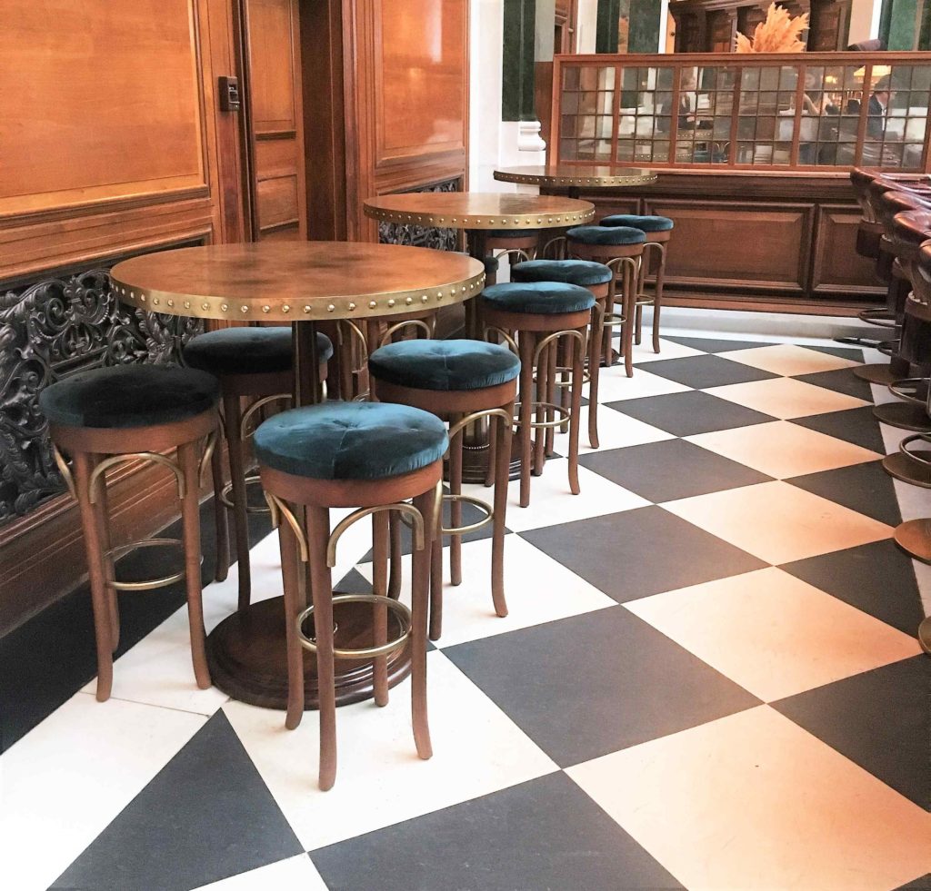
The upholstered velvet bar stools are a more ‘Kingfisher’ shade, which is distinctly more blue than it’s emerald cousin but still works beautifully with the other elements
Green and red compliment each-other most effectively. This is because they are totally contrasting (opposites on the colour wheel), ensuring each makes the other ‘pop’, unveiling their fullest potential. The deep greens here – variations on emerald and forest – flatter the russet red velvet, ruby accents and soft, burgundy leather perfectly. If you want to explore the idea of contrasting colours further, keep your eyes peeled for a future posts which will explore the best pairings.
 Green and red beautifully compliment each-other within a scheme and aren’t just for Christmas! The Ned showcases the that best way to incorporate this duo is by mixing in other elements too (hello, monochrome floor and brass accents)
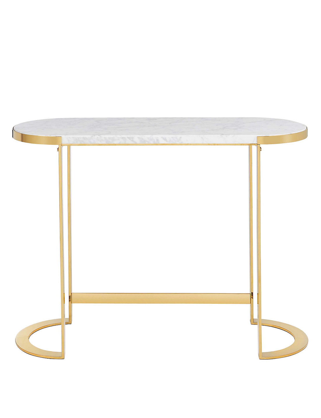
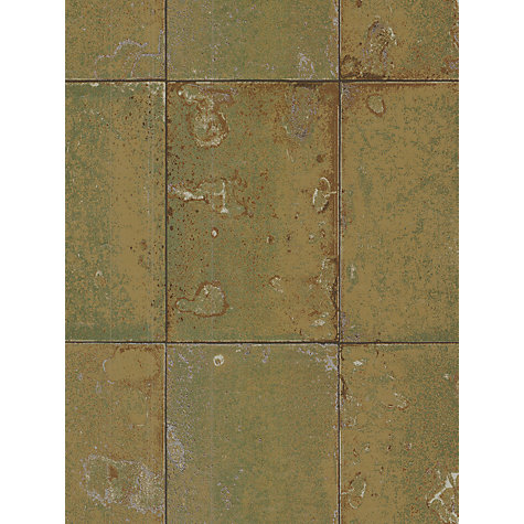
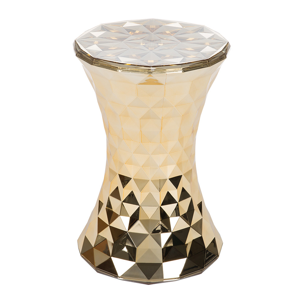
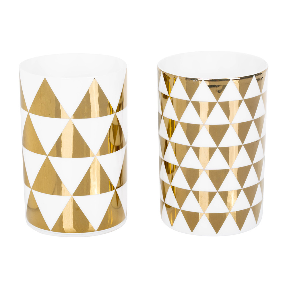
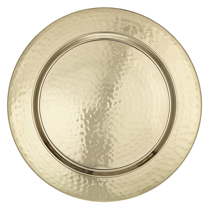
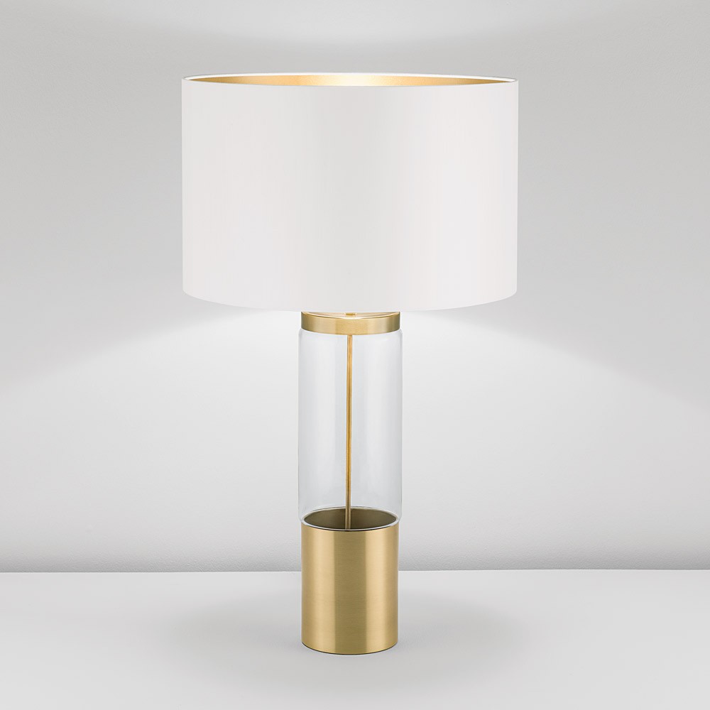
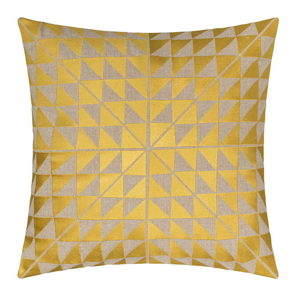
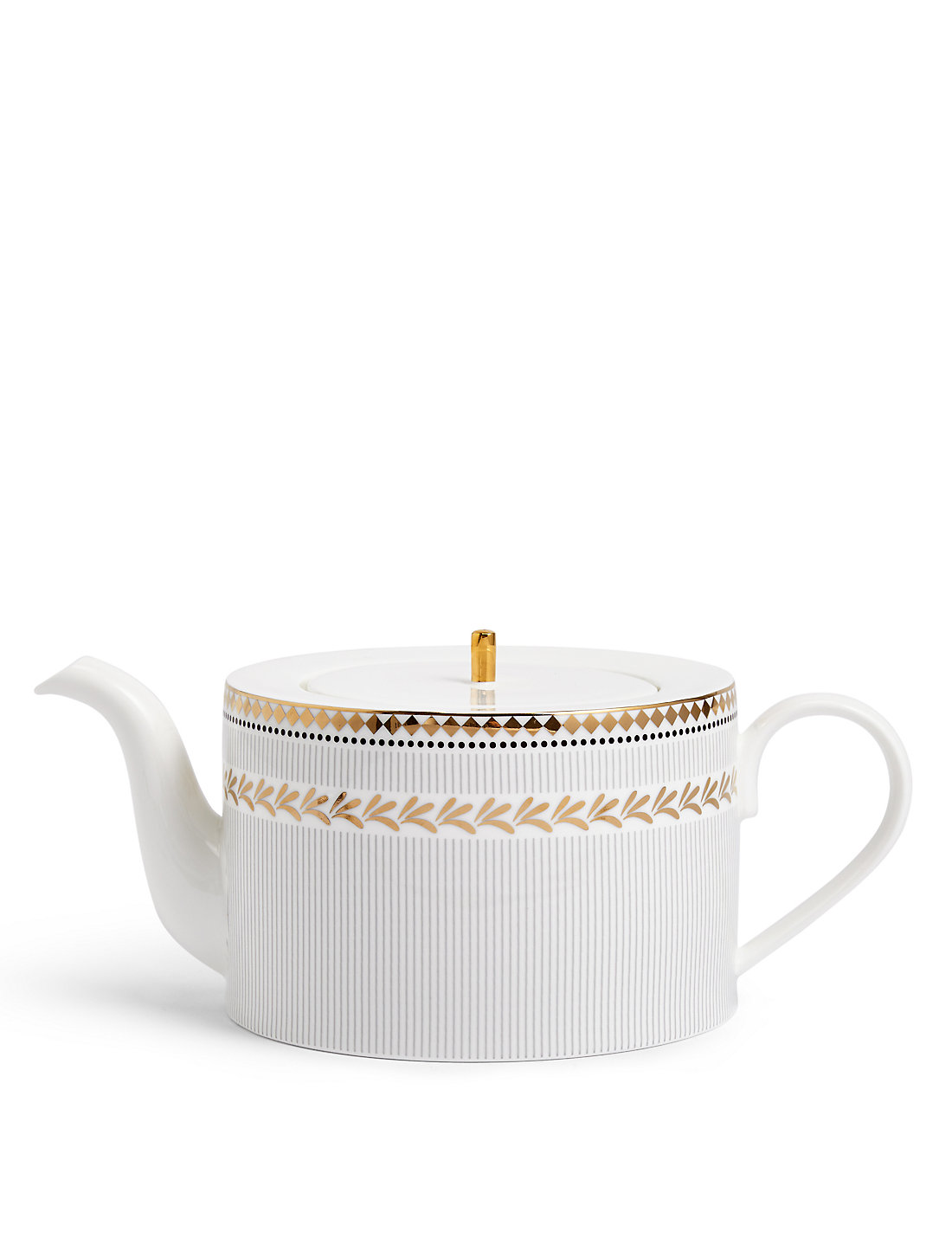
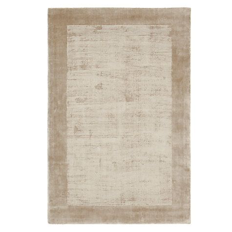
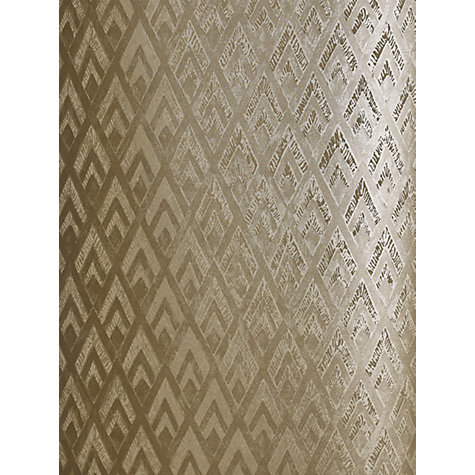
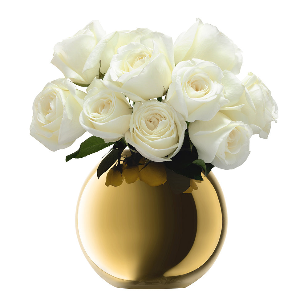
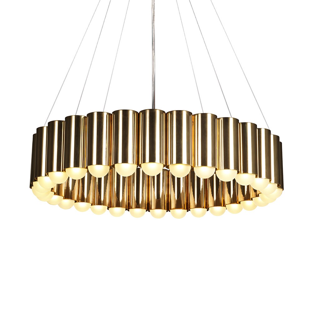
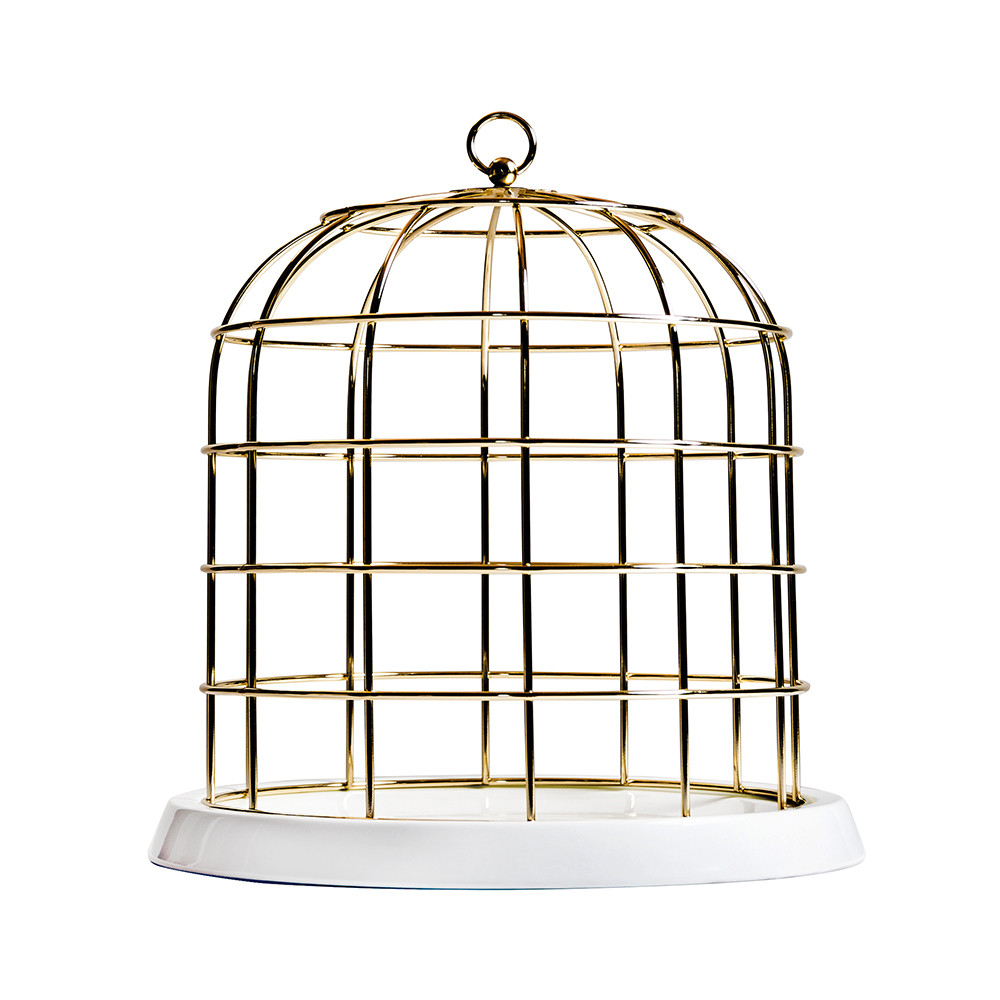
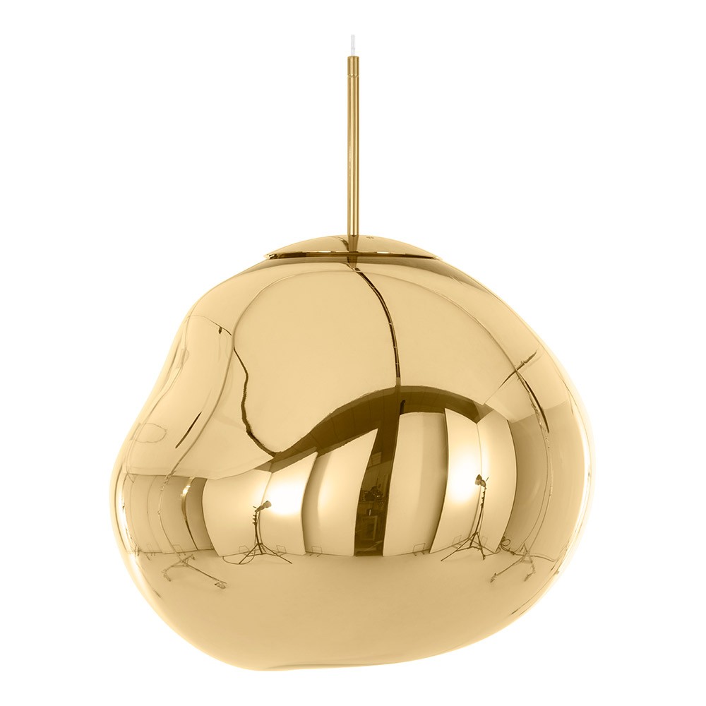
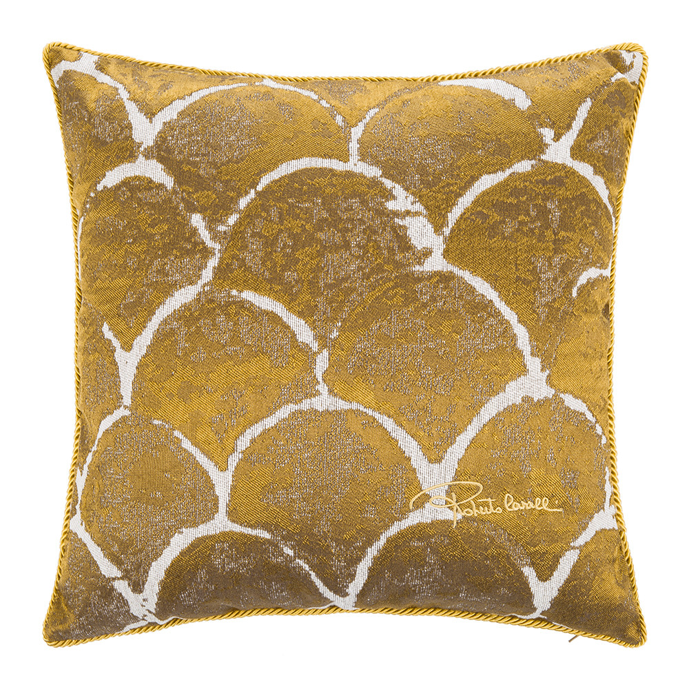
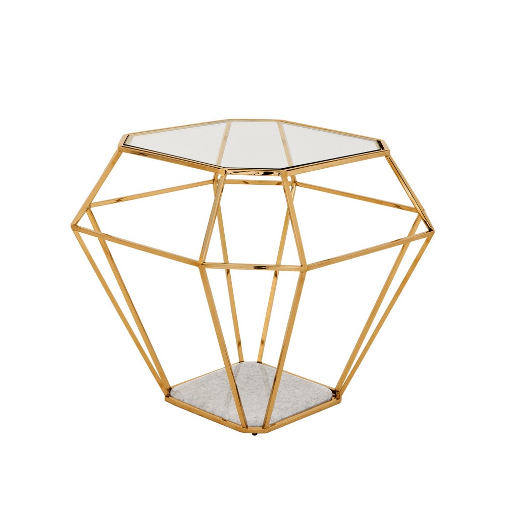
GOING FOR GOLD
Gold finishes are having a major moment. This isn’t a fair-weather phase, a throwaway look – brass tones are BIG BUSINESS and the Ned is fully on-board. I know that I mention gold a lot, but it’s a serious ‘no-brainer’. Eternally flattering and effective alongside most colours, gold tones are firmly embedded in 2017 design. Here’s my GOLD, Ned-influenced look-book:
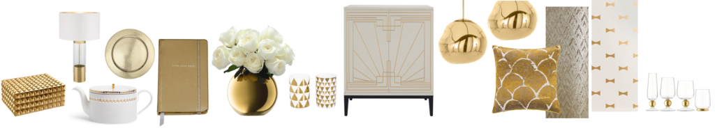
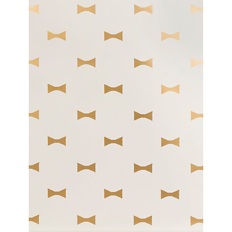
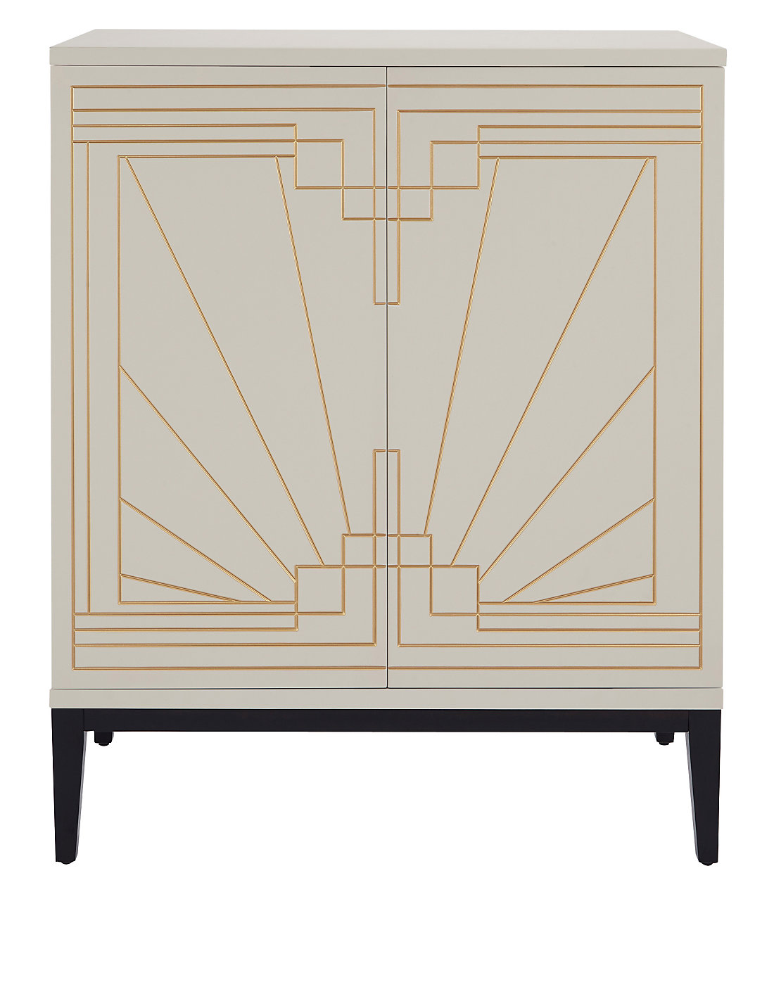
Evidently, it appears I have a geo-crush, (I do love an angled print after all). This is, however, perfectly placed in terms of The Ned’s interior look and feel which nods to/beams at Art Deco styling. I’m talking repeat geometrics, scalloped/scale prints and luxe finishes. Glamour, after all, is what its always been about.
GOLD RUSH: SHOP THE LOOK

So, there you have it folks. My whistle-stop tour of The Ned’s interior is complete – for now. And it really was pretty abridged. There is a lot I haven’t mentioned – the fabulous Cowshed Spa (ummm, heaven on earth), slick barbers, pretty powder room, ROOF TOP POOL! But all in good time. After all, I need plenty more excuses to go back…
GIRL ABOUT: KEEP IN TOUCH
Remember to subscribe to GIRL ABOUT HOUSE to ensure you don’t miss a moment of the action! I will continue to work excruciatingly late into the night to bring you the latest looks, carefully curated product edits, inspirational places and faces, styling tips and general musings. Lots more on my Instagram page and Facebook pages too.
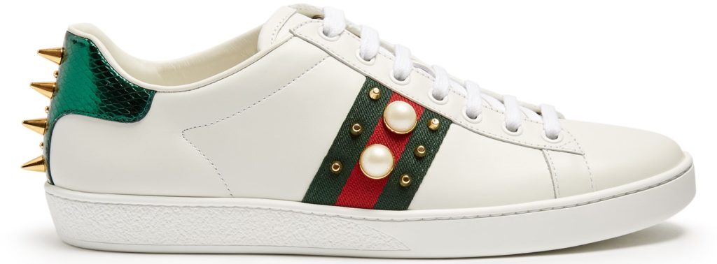
What were your favourite elements of The Ned hotel interior? Inspired? Anyone going to brave it and go full-on red, green and gold?! Oh, how fabulously Gucci!
Girl signing off,
Sarah x
 @2017 - Girl About House. All Rights Reserved.
5 thoughts on “HOW TO TAKE INTERIOR INSPIRATION FROM THE NED HOTEL (PART 2)”
Love this post! The Ned is so sexy. Really feeling the emerald! Rx
Thanks Rosanna! It is indeed – I felt ever-so-slightly Daisy Buchanan (Gatsby) just standing at the bar, minus the flapper dress and headband! Emerald is great because it’s so classic, yet so ‘now’ – green is having such a thing! Are you a big Deco fan?