
SPICED HONEY: 3 FRESH WAYS TO STYLE DULUX’S ‘COLOUR OF THE YEAR’ 2019
AND THE COLOUR IS… SPICED HONEY
Earlier this week, Dulux’s ‘Colour of the Year’ reveal was met with mixed emotions. ‘Spiced Honey’, a warm caramel shade with pleasing notes of amber, is the iconic paint brand’s champion hue for 2019. If you weren’t feeling autumnal, you should be now.
It’s a refreshing departure from the cooler palette we have grown so accustomed to. Desaturated shades of grey which have graced walls, floors and everything in-between over the past decade are slowly falling out of favour. Whilst last year’s lilac-tinged ‘Heart Wood’ was a half-way house for Dulux, Spiced Honey is total jail-break.
 Image: Dulux
I’m not surprised that this key design decision has divided opinion. As a rule, colour trend reveals are generally quite polarizing and this announcement feels like a seismic shift outside the collective comfort zone. My Instagram poll – the ultimate market research tool – showcased a close 44|56 divide with the majority ruling Spiced Honey ‘not my thing’.
SPICED HONEY – MY TAKE
So what’s my view of this divisive new shade? Is it something that I will embrace fully or breeze past like the Sports section of the paper?
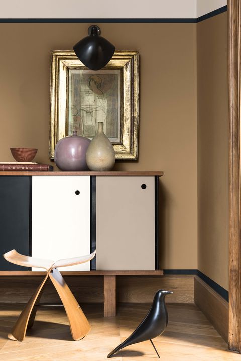
Image: Dulux
It’s probably glaringly obvious.
If engaging with this blog is something you make a habit of then firstly, thank you. In that case – and secondly – you’ll know I love a warm, nurturing shade. A colour that gives you a metaphorical hug.
Caramel hues and, in fact, all things ’70s made my colour prediction post back in January (read it here). Also my recent Mykonos Style post showcased similar natural, rattan-esque shades (read it here). It’s great to see the colour trend authorities aligning with me on this – promise I won’t let it go to my head..!
In truth, I am delighted with this colour choice! It feels somewhat heritage; deeply established whilst simultaneously offering something new. It’s also an incredibly sophisticated shade which wouldn’t look out of place in an imposing National Trust property. And whilst this announcement may feel like a total shock to the system, know that it’s actually been edging onto our radar for a couple of years now. Think about recent sartorial hero pieces – camel coats, caramel totes and leopard print. The signs were there all along.
 Sipping on a chai latte whilst nodding to Spiced Honey
HOW TO USE SPICED HONEY
Spiced Honey offers endless potential for experimentation and design innovation. But how to work with it? What best complements its depth and smooth appeal? Dulux have made their suggestions but I decided to set my own personal challenge of ‘one colour, three ways’.
The remainder of my post will demonstrate how you can take this hot-off-the-press shade and incorporate it successfully into different schemes. It never ceases to amaze me how context can alter colour so dramatically – softening, blending, enhancing and enriching it. That really is the beauty of design – the endless possibilities (or in this case, three).
Hopefully even the biggest Spiced Honey sceptic will be quickly converted…
LOOK #1 – SPICED HONEY X SOFT & DUSKY
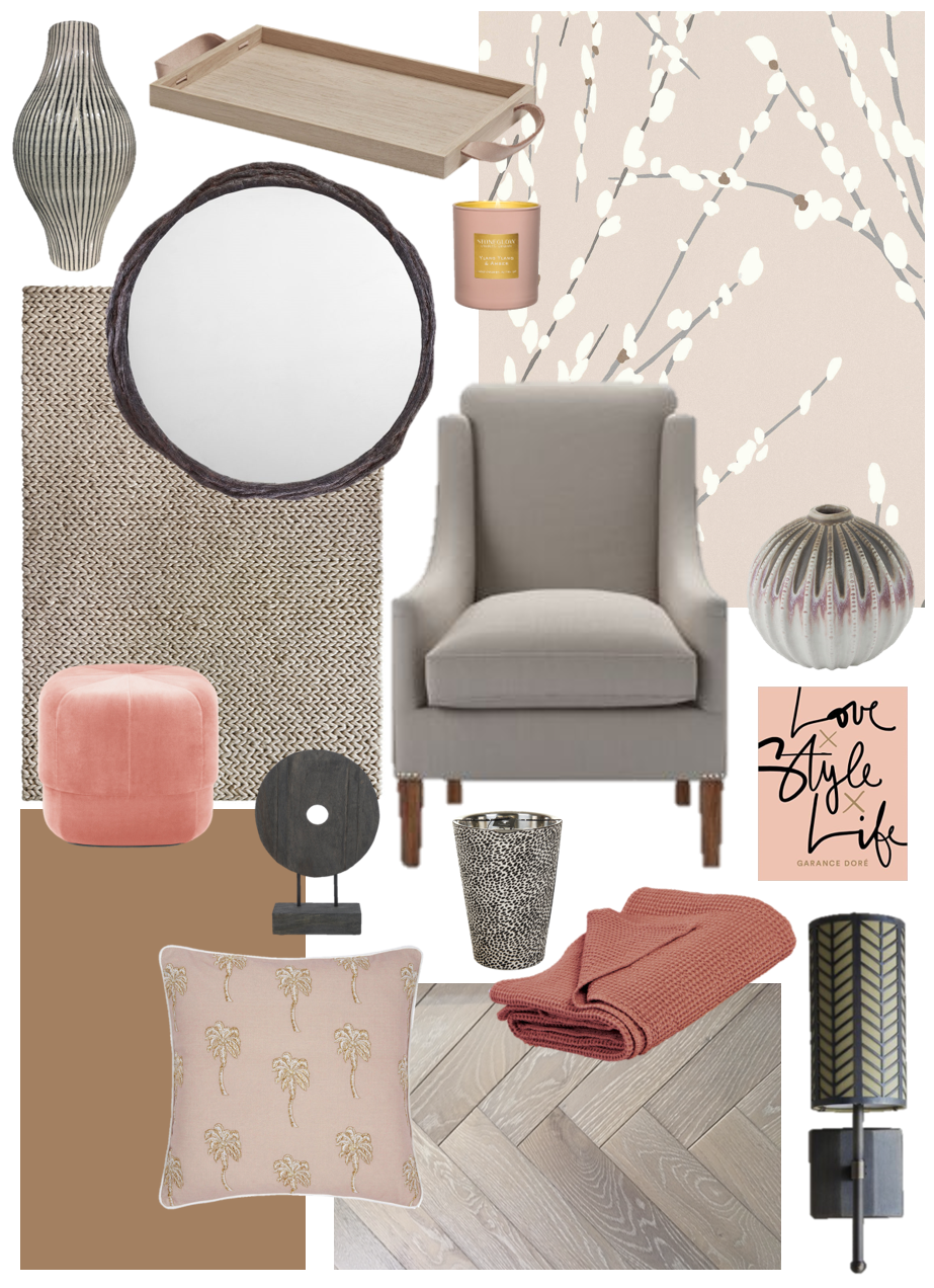 Soft & spicy!
We’re pulling both the amber and blush out of Spiced Honey for this scheme and it feels really new!
This winning combination of chalky shades with stronger blush pink creates a soft, flirty look and feel (read about trending pink here). Punctuate with accents of bronze or pewter, although you could also throw in some brass for good measure and enjoy an abundance of metallic finishes.
This scheme will feel really pretty and relaxed and I’ve even managed to cling to elements of grey for good measure. In terms of flooring, a light oiled-oak parquet or chevron keeps the look cool and contemporary with natural textures offering a layered aesthetic.
SOFT & DUSKY DESIGN DETAILS – Flooring| Rug | Wallpaper | Armchair | Footstool | Wall Light | Mirror | Palm Print Cushion | Tall Vase | Book | Blanket | Baobab Candle | Low Vase | Tumbler Candle | Wooden Sculpture | (click for links)
LOOK #2 – SPICED HONEY X RICH RUSSET & NAVY
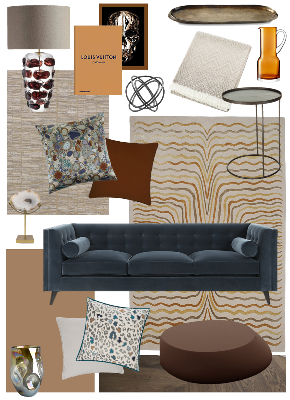 Mad-Men moments…
Mid-Century design feels all grown up in this rich and sophisticated scheme. Dark, punchy accents ground the look which was built around this fabulous Allegra Hicks x The Rug Company ‘Labyrinth’ floor-covering. The deep navy elements offer a strong contrast with Spiced Honey’s warm caramel hues. It’s a striking and bold combination which is perfect for a more formal space.
Introduce print through playful accent cushions, diluting busy pattern with pared-back plains in sumptuous textiles. Velvet, dark timber, amber glass and gold accents work particularly well with this look. And a well-selected coffee table book – or two – never goes amiss. Read about how to style with the coffee table book here.
RICH RUSSET & NAVY DESIGN DETAILS – Flooring | Rug | Wallpaper | Sofa | Coffee Table | Tray Table | Lamp | Animal Print Cushion | Gemstone Cushion | Plain Cushion Beige | Throw | Louis Vuitton Book | Alexander McQueen Book | Ball Sculpture | Tray | Agate Sculpture | Collision Amber Vase | Jug | (click for links)
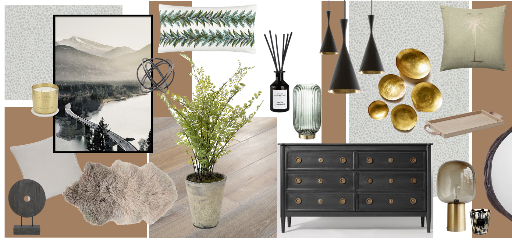
LOOK #3 – SPICED HONEY X EARTHY PUNCH
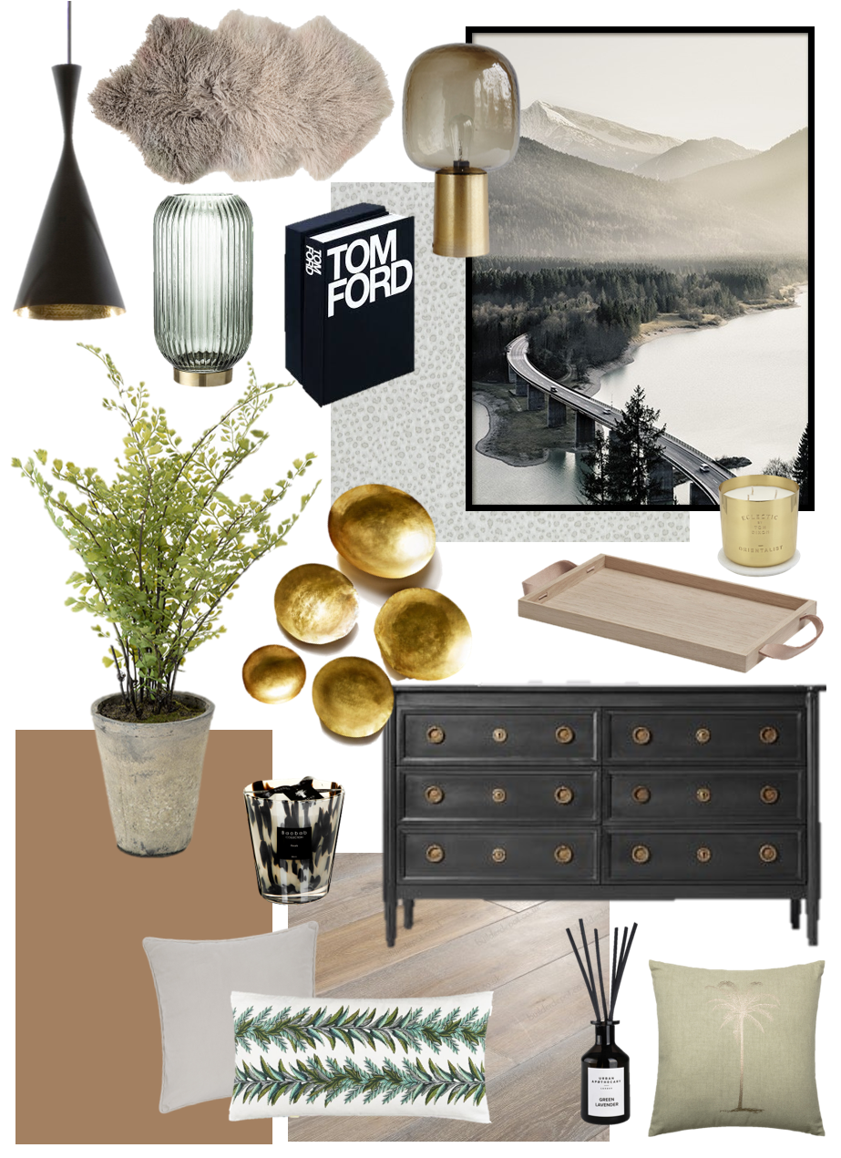 Feeling fresh!
Combine soft silver and greeny-greys with touches of khakis and fern to create a natural scheme to complement Spiced Honey. Earthy tones expand with quiet nods to duck-egg and seafoam which also work beautifully with this trending shade.
A smoked, oiled oak is the perfect foundation – it feels textured and natural whilst offering some cooler undertones. Then, up the ante by incorporating monochromatic elements and a smattering of glorious gold. I’d like to add a succulent or two when styling this, alongside some graphic art or coffee table books. A little touch of animal print offers a playful injection too, although the mantra ‘less is more’ should be applied here.
I love this look! Eternally bringing the outside in…
EARTHY PUNCH DESIGN DETAILS – Flooring | Rug | Wallpaper | Sideboard | Pendant Light | Lamp | Plain Cushion Beige | Palm Cushion | Leafy Rectangular Cushion | Artwork | Plant | Set of Bowls | Book | Glass Vase | Diffuser | Tom Dixon Candle | Baobab Candle | (click for links)
SPICE UP YOUR LIFE
 It’s a winner!
I’d love to hear your thoughts on the latest shade-du-jour and if you’ve enjoyed any of these looks. Please let me know in the comments below as I always welcome feedback!
I have had an incredible amount of fun conceptualising the Spiced Honey mood-boards and bringing them to fruition in this post. I do hope you’ve found them useful and inspiring. Will you be attempting any Spiced Honey flavoured schemes in your home? Please let me know if you’re thinking of taking the plunge or how else you could envisage it being used.
Girl signing off,
Sarah x
*Connect with my Instagram account for more adventures in colour, print, fashion and interior design.
 @2017 - Girl About House. All Rights Reserved.
5 thoughts on “SPICED HONEY: 3 FRESH WAYS TO STYLE DULUX’S ‘COLOUR OF THE YEAR’ 2019”
Brilliant piece – beautifully written and really informative. Lots of inspiration there.
Martha x
Perfect timing I have just got my Spiced Honey matt paint and I was trying to work out my colour combinations, great ideas. I especially like the navy.
Very useful tips and ideas, thank you! The navy is my favorite one because when I just look at it, I get the feeling of a metaphorical hug, as you’ve described it. Soft caramel shade is already warm, but navy enhances that feeling even more and makes it look so bold, especially because it adds a contrast at the same time. Although, I do love the earthy tones too.
Great tips!! Nice colors, decor items ideas. Thanks for sharing.